
The Best and Worst Web Design Trends This Year
Design trends come and go, and every year has its defining trends. A few years ago it was parallax scroll. Before that, rotating homepage banners were a must have for every website, regardless of whether or not they were helpful in communicating the brand’s message.
There are a handful of trends we’ve seen taking root in 2017 or being carried over from last year. Long and infinite-scroll is still popular for content-heavy sites, and grid layouts are going strong. Some design trends are more appealing than others, though, and there are certainly some trends we would be fine parting with this year. Here is a short list of some of the best and worst of the design trends we’ve seen in 2017.
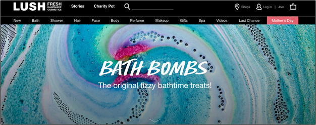
BEST – Bold typography
Bold typography is making a big splash this year. You can find it everywhere — from graphic t-shirts, to home decor, to book cover design, and of course web design. Bold typography is visually-arresting — in some cases even more so than a compelling image would be. An interesting font rendered against an abstract or plain background will draw the eye right to it.
Bold typography also helps communicate a message loud and clear, which is an effective way to define brand personality and appeal. Below, Lush uses their trademark typography to define each of their product category pages.
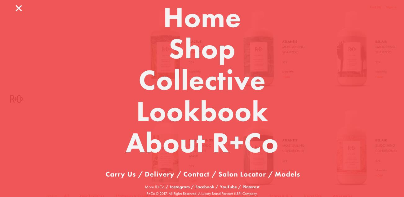
WORST – Desktop hamburgers
R+Co (shown above) might have great bold typography, but they also have a desktop “hamburger menu”, which is one recent design trend we’re less thrilled about.
Hamburger menus make total sense on mobile, where space for a horizontal navigation is very limited and any static navigation menu would render the rest of the content on the page inaccessible. But the same problem does not exist on desktop, which means that the hamburger menu isn’t a necessity, it’s a design whim — and one that doesn’t make a whole lot of sense for the user. The goal of the homepage is to get the user where they want to go as quickly as possible. The hamburger menu, when executed on desktop, doesn’t support this goal.
BEST – Cinemagraphs
Our eyes are naturally drawn to movement, but overwhelming users with movement on a homepage can end up being more chaotic than compelling. That’s what makes cinemagraphs and short looped videos such a great choice. They can help capture a user’s attention, while also conveying something meaningful — such as how people use a product or service. Demonstrating a use case helps the user connect with the product by allowing them to project themselves into a situation and making them see how the product fits into their lives.
WORST – Extreme minimalism
Minimalism has been a trend in the design world for a few years now. Its influence can be seen in clothing design, interior design, and in web design as well. There’s nothing wrong with minimalist web design when it makes sense. For a company with a simple mission, purpose, or product offering and a minimalist aesthetic, it can be an effective choice. But when so many brands jump on the bandwagon that every website begins to blur together in a haze of plain white backgrounds, grey text, and a single black and white image, the trend may have gone a bit too far.
We’re happy to see bolder palettes and layouts popping up this year, because there is such a thing as too much minimalism.
BEST – Custom illustrations
Stock photography is falling way out of favor with design-forward companies. Stock images are usually stiff, awkward, or downright ridiculous, so it makes sense that companies are moving toward more personalized visuals. Included in that movement is the increased use of custom illustrations. We love this trend because illustration is a great way to bring personality, whimsy, and charm to a brand’s website. It can make a website more memorable, and a brand easier to connect with.
Trends, by definition, come and go. Some of them stand the test of time to become design norms. Others make us look back and cringe inwardly or laugh out loud. Only you can say for sure if following a certain trend makes sense for your brand. Some trends may work well for you, while others will just fall flat. Web design is personal — so monitor the trends and learn from others, but don’t follow along just because it’s what everyone else seems to be doing.


forex merchant account
September 27, 2021 at 3:56 am… [Trackback]
[…] Find More to that Topic: wishtreeinfosolutions.com/best-worst-web-design-trends-year/ […]
glo extracts
September 29, 2021 at 1:09 pm… [Trackback]
[…] Find More here on that Topic: wishtreeinfosolutions.com/best-worst-web-design-trends-year/ […]
relx
October 2, 2021 at 3:59 am… [Trackback]
[…] Read More Information here to that Topic: wishtreeinfosolutions.com/best-worst-web-design-trends-year/ […]
kardinal stick
October 2, 2021 at 4:51 am… [Trackback]
[…] Find More Info here to that Topic: wishtreeinfosolutions.com/best-worst-web-design-trends-year/ […]
คาสิโนออนไลน์เว็บตรง
November 3, 2021 at 7:22 am… [Trackback]
[…] Find More to that Topic: wishtreeinfosolutions.com/best-worst-web-design-trends-year/ […]
Commercial Building Surveillance
November 19, 2021 at 5:30 am… [Trackback]
[…] Find More on that Topic: wishtreeinfosolutions.com/best-worst-web-design-trends-year/ […]
cool travel itinearies
December 2, 2021 at 9:58 pm… [Trackback]
[…] Find More Information here to that Topic: wishtreeinfosolutions.com/best-worst-web-design-trends-year/ […]
en iyi casino siteleri
December 11, 2021 at 12:07 am… [Trackback]
[…] Read More here to that Topic: wishtreeinfosolutions.com/best-worst-web-design-trends-year/ […]
cvv fullz
December 23, 2021 at 1:47 pm… [Trackback]
[…] Read More Information here on that Topic: wishtreeinfosolutions.com/best-worst-web-design-trends-year/ […]
Online Gun Shops USA
December 28, 2021 at 8:54 pm… [Trackback]
[…] Find More on to that Topic: wishtreeinfosolutions.com/best-worst-web-design-trends-year/ […]
imp source
January 6, 2022 at 2:55 pm… [Trackback]
[…] Here you can find 54603 additional Info to that Topic: wishtreeinfosolutions.com/best-worst-web-design-trends-year/ […]
2exuberance
January 13, 2022 at 6:27 am1nomadic
gay video chat
January 14, 2022 at 6:14 pmgay senior chat https://bjsgaychatroom.info/
good gay chub dating
January 14, 2022 at 9:39 pmblack gay men dating sites https://gaypridee.com/
gay chat rooms black
January 14, 2022 at 10:31 pmsex chat gay https://gaytgpost.com/
avenue-chat gay onlice
January 15, 2022 at 3:35 amgay phone sex chat commercial https://gay-buddies.com/
cc dumps with pin
January 15, 2022 at 2:11 pm… [Trackback]
[…] Find More on to that Topic: wishtreeinfosolutions.com/best-worst-web-design-trends-year/ […]
gay boys free dating websites
January 15, 2022 at 6:09 pmmacrosonic dating sim gay https://speedgaydate.com/
Phygitalization of Retail
January 26, 2022 at 7:44 pm… [Trackback]
[…] Find More Information here to that Topic: wishtreeinfosolutions.com/best-worst-web-design-trends-year/ […]
ตรวจหวย
January 27, 2022 at 5:35 am… [Trackback]
[…] Information on that Topic: wishtreeinfosolutions.com/best-worst-web-design-trends-year/ […]
free online slots
January 28, 2022 at 10:38 pmlas vegas games free slots https://2-free-slots.com/
river slots download
January 29, 2022 at 7:03 amfree triple diamond slots https://candylandslotmachine.com/
free slots to play online
January 29, 2022 at 9:27 amdouble diamond slots https://pennyslotmachines.org/
lobstr fest 11 slots
January 29, 2022 at 1:54 pmreal money slots https://slotmachinesworld.com/
jackpot party casino slots
February 3, 2022 at 11:43 pmhouse of fun slots https://slotmachinesforum.net/
zelda inventory slots
February 4, 2022 at 3:43 amfree hot slots https://slot-machine-sale.com/
vegas downtown slots
February 4, 2022 at 6:33 amtriple diamond free slots https://beat-slot-machines.com/
i won $4 at penny slots
February 4, 2022 at 10:47 amhow to win at slots https://download-slot-machines.com/
i won $4 at penny slots
February 4, 2022 at 2:43 pmvegas grand slots https://411slotmachine.com/
ff tactics 24 slots
February 4, 2022 at 4:38 pmonline slots free https://www-slotmachines.com/
free siberian storm slots
February 4, 2022 at 6:53 pmwow character slots https://slotmachinegameinfo.com/
홀덤사이트
February 6, 2022 at 5:09 am… [Trackback]
[…] Find More on to that Topic: wishtreeinfosolutions.com/best-worst-web-design-trends-year/ […]
dissertation acknowledgement example
February 11, 2022 at 12:36 amdissertation proposal template https://buydissertationhelp.com/
finance dissertation help
February 11, 2022 at 10:25 pmdissertation service https://dissertationwriting-service.com/
writing an abstract for a dissertation
February 12, 2022 at 12:55 amdissertation editor cost https://help-with-dissertations.com/
dissertation editor cost
February 12, 2022 at 4:51 amphd dissertation help database https://mydissertationwritinghelp.com/
dissertation dedication
February 12, 2022 at 9:18 amdefend dissertation https://dissertations-writing.org/
dissertation help in mumbai
February 12, 2022 at 12:34 pmpurchase dissertation https://helpon-doctoral-dissertations.net/