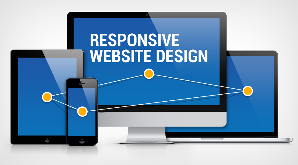
What Is a Responsive Web Design: Understanding the Basics
Today, as users, were constantly on-the-go. The majority of website visits start on mobile devices, and according to eMarketer, Mcommerce sales for US retail will be increasing with each coming year. As a result, optimizing website accessibility and user experience on tablets, smartphones, and every device imaginable is becoming increasingly important in order for all businesses to stay relevant. To accommodate users, websites that are designed responsively are typically the best option available.
Responsive design is an approach to web development by which a website is planned, designed, and developed to appear optimally in a range of devices. The phrase appear optimally refers to a page being readable, easy-to-navigate, and usable with minimal panning and scrolling. Responsive Design is not just a method or technique – it is a fundamental ideology about how a site is designed and built.
What Is A Responsive Web Design?
Responsive design is a front-end development process intended for molding website design and user experience to the users device, whether desktop, tablet, or mobile.
In responsive, a cascading style sheet (CSS)essentially what defines the format and layout of a web page, is leveraged to permit a website to scale to the width of a browser, independent of device type. Javascript and js libraries such as JQuery and Modernizr are also used to accompany this behavior for resizing more dynamic objects like masonry galleries as well as converting mouse activities to touch activities.
Unlike adaptive design or mobile detection, responsive design does not leverage device detection, so rather than querying the device with backend logic, CSS media queries are used to determine things like the width and orientation of the device screenyour browser.
Basics of Responsive Design
Two basic principles exist in responsive design, the use of breakpoints and fluid scaling:
Breakpoints
CSS3 media queries create conditional boundaries at which the width of a specific device types browser will then trigger alternate styles. Here at Wishtree, we generally use maximum-width breakpoint, to create a desktop-first (scale down) build versus a minimum-width boundary, for a mobile-first (scale up) build. Queries can also be used to determine height and even device orientation.
Breakpoint sizes (well use widths from here on out) can be set in px or em. The differentiation in modern browsers is negligible, though, compared to a few years back. Breakpoints can be set at any size but they tend to align with the most common dimensions of each Desktop, Tablet Portrait, Mobile Landscape, and Mobile Portrait. Generally speaking, these tend to be 1200/960px, 768px, 480px, and 320px, wide respectively, though industry standards are constantly changing as new devices are released.
Over the years, these types of devices have begun to blend into one another, especially with the introduction of retina displays. As a result, you might find two devices can match the same breakpoint (ie. tablet landscape and laptop) but might also find that a particular device has a unique size, so thats where the next principle comes into play.
Fluidity
Fluid scaling can be achieved in a few different ways, but it will always involve percentage or em values to permit a container to scale within the bounds of its parent elements, and ultimately the browser. Fluid scaling is necessary to achieve responsiveness between breakpoints, to maximize your real estate, as well as to maintain the flow of columns in a responsive grid.
A simple example of a fluidly scaling object would be an HTML page consisting of one block with width of 100% and a height of auto. As the browser changes width, the block scales with it, proportionally. Where you choose to apply this scaling at the granular level is up to you but fluidity should always exist at the top level of any responsive container.
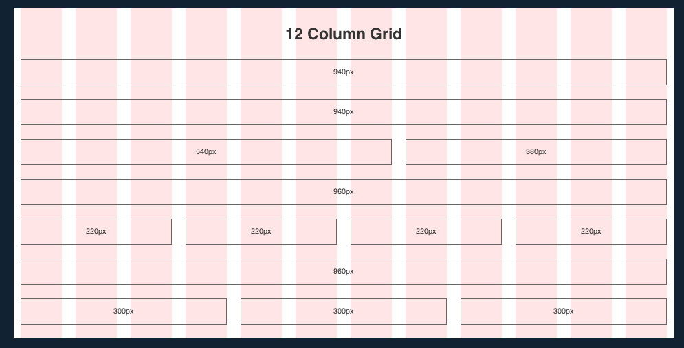
Another popular example of fluidity is a grid layout. In a grid layout, virtual blocks are aligned and evenly distributed over the width of the body of a site or container. These blocks are fixed in width, aligned as inline-blocks, with a parent container which is fluidly scaling. By doing tis, when the browser (and ultimately, the container) reaches the point at which the sum of all blocks exceeds its parent container, the blocks break to the next line. These blocks are referred to as columns and each block could also represent a number of columns.
For instance, if you have 3 blocks, they could represent 9 columns, at 3 columns each. Once youve scaled down to a width that fits 2 blocks, at 3 columns each, with the 3rd on the next row, youre now looking at an 8 column layout, with 2 columns of margin. Scale down further to close out the margin and youre looking at a 6 column layout with no margin.
Design
Grid layouts may also be used across an entire website, including sidebars and body content. As a result, many websites are designed on grids, flowing from left to right, top to bottom (just like germanic and latin-based written languages).
In order to present the optimally responsive layout for a grid, we start by selecting the known device widths from our knowledge of breakpoints. Using these figures, we calculate the nearest figure of the site width and number of columns, which divide into the greatest number of whole factors. We must do this without compromising the contents real estate much (so dont go overboard). One of the most popular systems is the 960grid system, which is often used in 12 columns. Two side-by-side blocks taking up the full width of a page is therefore each 6 and 6 columns respectively, in a 12 column grid.
When designing and developing for responsive, we place emphasis on retaining the structure and order of elements from desktop through mobile. This permits fluid scaling while also reducing unnecessary load of duplicate elements that are hidden or shown at specific breakpoints.
Responsive Design at Wishtree Infosolutions
At Wishtree Infosolutions, our 2015 standards for responsive design include options for a standard 960 grid, requiring designs for desktop and mobile, as well as a widescreen 1200px or 1280px grid requiring designs for widescreen, tablet or 960, and mobile. All interim stages are either snapped via breakpoints, to the next breakpoint size, or fluidly scaling – the complexity of the design and scope of the project will dictate that decision.
Our talented development team includes full stack developers as well as frontend specialists, all of whom are trained in responsive practices and are evaluated on a quarterly basis. We perform quality checks of all the major browsers and aforementioned breakpoint widths both manually and using a proprietary screenshotting service built off of PhantomJs, as well as with manual device testing with our in-house QA engineers.
Optimizing User-Experience
Regardless of your industry or the products and services your company offers, user-experience on your website should be of the utmost importance. With responsive design, your audience will always be able to engage seamlessly with your site on each of their devices, at any given time. Mobile and tablet use is becoming more and more prevalent, and to succeed with your online presence, your website should be optimized for those devices and their users.

redabahoum.com
September 28, 2021 at 2:36 pm… [Trackback]
[…] There you can find 83869 more Info on that Topic: wishtreeinfosolutions.com/what-is-a-responsive-web-design-understanding-the-basics/ […]
meal plan 1200 calories a day
September 29, 2021 at 10:50 pm… [Trackback]
[…] Information on that Topic: wishtreeinfosolutions.com/what-is-a-responsive-web-design-understanding-the-basics/ […]
franchi instinct
October 1, 2021 at 8:18 pm… [Trackback]
[…] Find More Info here on that Topic: wishtreeinfosolutions.com/what-is-a-responsive-web-design-understanding-the-basics/ […]
about us
October 6, 2021 at 7:55 pm… [Trackback]
[…] Read More Information here to that Topic: wishtreeinfosolutions.com/what-is-a-responsive-web-design-understanding-the-basics/ […]
Buy Tikka Rifles Online
October 13, 2021 at 7:30 pm… [Trackback]
[…] There you will find 99497 additional Info on that Topic: wishtreeinfosolutions.com/what-is-a-responsive-web-design-understanding-the-basics/ […]
junk removal near me
October 22, 2021 at 9:00 am… [Trackback]
[…] Read More Info here to that Topic: wishtreeinfosolutions.com/what-is-a-responsive-web-design-understanding-the-basics/ […]
kardinal stick
October 27, 2021 at 5:27 am… [Trackback]
[…] Find More on to that Topic: wishtreeinfosolutions.com/what-is-a-responsive-web-design-understanding-the-basics/ […]
relx
November 10, 2021 at 6:09 am… [Trackback]
[…] Info on that Topic: wishtreeinfosolutions.com/what-is-a-responsive-web-design-understanding-the-basics/ […]
บาคาร่า1688
November 15, 2021 at 5:20 am… [Trackback]
[…] Read More on to that Topic: wishtreeinfosolutions.com/what-is-a-responsive-web-design-understanding-the-basics/ […]
dumps vendor
November 15, 2021 at 1:25 pm… [Trackback]
[…] Here you will find 14997 additional Info to that Topic: wishtreeinfosolutions.com/what-is-a-responsive-web-design-understanding-the-basics/ […]
https://tontonmania123.com/
November 16, 2021 at 8:02 pm… [Trackback]
[…] Info to that Topic: wishtreeinfosolutions.com/what-is-a-responsive-web-design-understanding-the-basics/ […]
islot99
November 21, 2021 at 5:40 am… [Trackback]
[…] There you can find 44259 more Info to that Topic: wishtreeinfosolutions.com/what-is-a-responsive-web-design-understanding-the-basics/ […]
dispensary security
November 22, 2021 at 5:08 am… [Trackback]
[…] Find More on that Topic: wishtreeinfosolutions.com/what-is-a-responsive-web-design-understanding-the-basics/ […]
places to visit
December 2, 2021 at 9:21 pm… [Trackback]
[…] Find More Information here to that Topic: wishtreeinfosolutions.com/what-is-a-responsive-web-design-understanding-the-basics/ […]
หูฟังล่าม
December 7, 2021 at 6:35 pm… [Trackback]
[…] Here you will find 50364 additional Information on that Topic: wishtreeinfosolutions.com/what-is-a-responsive-web-design-understanding-the-basics/ […]
bettilt giris
December 11, 2021 at 12:04 am… [Trackback]
[…] Read More on on that Topic: wishtreeinfosolutions.com/what-is-a-responsive-web-design-understanding-the-basics/ […]
คาสิโนออนไลน์เว็บตรง
December 19, 2021 at 6:26 am… [Trackback]
[…] Find More Info here on that Topic: wishtreeinfosolutions.com/what-is-a-responsive-web-design-understanding-the-basics/ […]
Online Gun Shops USA
December 28, 2021 at 8:15 pm… [Trackback]
[…] Info on that Topic: wishtreeinfosolutions.com/what-is-a-responsive-web-design-understanding-the-basics/ […]
slot999
January 6, 2022 at 5:47 am… [Trackback]
[…] Information to that Topic: wishtreeinfosolutions.com/what-is-a-responsive-web-design-understanding-the-basics/ […]
wow slot
January 11, 2022 at 5:09 am… [Trackback]
[…] Find More here on that Topic: wishtreeinfosolutions.com/what-is-a-responsive-web-design-understanding-the-basics/ […]
1subdivision
January 13, 2022 at 3:35 am2customize
free phx gay chat
January 14, 2022 at 3:40 pmgay chat rooms no registration https://bjsgaychatroom.info/
gay dating site free
January 14, 2022 at 8:55 pmleather men gay minneapolis dating https://gaypridee.com/
dubuque gay chat
January 14, 2022 at 11:37 pmchat avenue gay chat room https://gaytgpost.com/
gay chat roulette
January 15, 2022 at 3:06 amfree one on one gay sex chat on camera for masterbation https://gay-buddies.com/
mega888
January 16, 2022 at 11:52 am… [Trackback]
[…] Read More here on that Topic: wishtreeinfosolutions.com/what-is-a-responsive-web-design-understanding-the-basics/ […]
real casino free slots
January 29, 2022 at 12:27 amdouble down free slots https://2-free-slots.com/
456 free slots casino
January 29, 2022 at 2:48 amaristocrat slots https://freeonlneslotmachine.com/
free slots home 12345
January 29, 2022 at 5:02 amgoogle free slots https://candylandslotmachine.com/
bellagio slots guide
January 29, 2022 at 8:58 ammirror ball slots https://pennyslotmachines.org/
free slots vegas world
February 3, 2022 at 11:42 pmvegas slots https://slotmachinesforum.net/
lucky slots on facebook
February 4, 2022 at 2:30 amnms exocraft slots https://slot-machine-sale.com/
vegas slots
February 4, 2022 at 5:25 amfree coins hot shot slots https://beat-slot-machines.com/
king kong slots
February 4, 2022 at 9:58 ambrazilian beauty slots https://download-slot-machines.com/
free poker slots
February 4, 2022 at 12:28 pmbrian christopher slots https://411slotmachine.com/
casino slots
February 4, 2022 at 4:48 pmpenny slots free online https://www-slotmachines.com/
wobka slots promo codes
February 4, 2022 at 7:35 pmmonopoly slots/pogo https://slotmachinegameinfo.com/
Reliant Energy Reviews
February 8, 2022 at 5:07 am… [Trackback]
[…] Read More on that Topic: wishtreeinfosolutions.com/what-is-a-responsive-web-design-understanding-the-basics/ […]
doctoral dissertation help video
February 11, 2022 at 12:25 amhelp with masters dissertation https://buydissertationhelp.com/
dissertation in spanish
February 11, 2022 at 9:54 pmdissertation help in dubai https://dissertationwriting-service.com/
dissertation lengths
February 12, 2022 at 12:53 amphd dissertation peer reviewing help https://help-with-dissertations.com/
definition of dissertation
February 12, 2022 at 5:52 amhelp writing dissertation https://mydissertationwritinghelp.com/
phd dissertation example
February 12, 2022 at 7:18 amdissertation help service books https://dissertations-writing.org/
dissertation writing services mumbai
February 12, 2022 at 12:05 pmsite:tickettailor.com dissertation help https://helpon-doctoral-dissertations.net/
canadianpharmaceuticalsonline.home.blog
August 27, 2022 at 7:45 amcialis prices https://canadianpharmaceuticalsonline.home.blog/
Nicely put. Cheers.