29 Best Facebook Ad Campaign Examples to Follow and Learn From
Running out of ideas? Having trouble to keep up to date? Falling back? Not converting? Not reaching goals? Trouble finding the right tone? Lack of audience? Don’t worry. Almost every marketer goes through these phases when trying to come up with perfect ad campaigns that would grab attention from their audience on multiple Social Media platforms and not to mention the glorious algorithm changes which would make it even harder.
One problem on top of another. If somehow you have managed to hit strikes all on your tries, we don’t don’t know what sort of wizardry you are using for your clients or for your own brand. Congratulations to you! Not because you are succeeding each and every time. It’s for the massive wall you would hit someday in the future regardless of how successful your campaigns are. So brace for the impact, my friend.

THE INTERNET IS A VORTEX. (Source)
Even though we can’t help you with such a crisis with 110% precision, we can definitely help you to get better and maybe even clone some of the examples we would be showcasing below. Take what you love and hate and mould something beautiful. It’s up to you entirely. Also, you will get an overview of the latest design trends, hacks, and innovations which are working for others on the battlefield.
We always try to seek inspirations from some of the big brands out there. Like Picasso quoted “Good artists copy, great artists steal”. Not denying the fact that we copy everything (just kidding).
We will be covering both Instagram and Facebook here with a huge chunk of examples and inspirations. Save it, bookmark it. You might want to keep it in your archive.
As you go through the read,
- You will have a better understanding of what’s working and what is not.
- Inspirations to make use of.
- Willingness to take the risk with new campaigns and ideas.
- Compare yourself with the best about there and just learn and improve.
We will try to explain some of the features of the ad and why it stands out. Rest, you will get the idea.
Try to keep up. Let’s dive in!
#1 PayPal

PayPal
Why?
The use of icons and it’s impression on users. Engagement in return which doubles down the ad cost with its beautiful colour combo and minimal design.
#2 Shopify

Shopify
Why?
Not everything has to be a sales pitch. Here’s Shopify trying to promote their blog content online instead of promoting their niche. Acute lesson to be learned here.
#3 Google
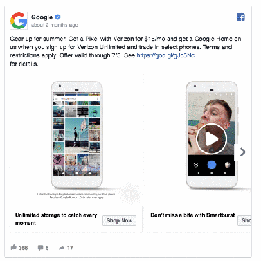
Why?
Yeah, a video inside a carousel is also possible with Facebook’s Dynamic ad features. Brings the product or service some life into it.
#4 GoPro

GoPro
Why?
Here, GoPro is giving an option for their existing loyal customers with a trade-up option. Go Custom audience to the core and show them this particular offer to get upgraded. Results will follow. Who doesn’t like an upgrade?
#5 Teabox
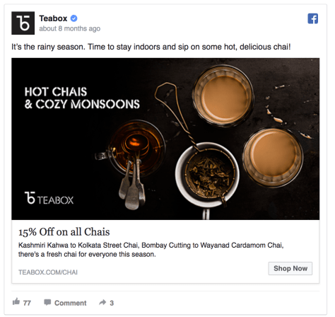
Teabox
Why?
Presale countdown ads for Facebook are a great way to build up some hype chain and get people to save the date to grab your offer. It works well.
#6 Leadpages

Leadpages
Why?
If you’ve got a decent number or stat you could brag out to the public? Why not brag it out through Facebook as a means of promotion? Creates a reputation for yourself and build more trust.
#7 Asana
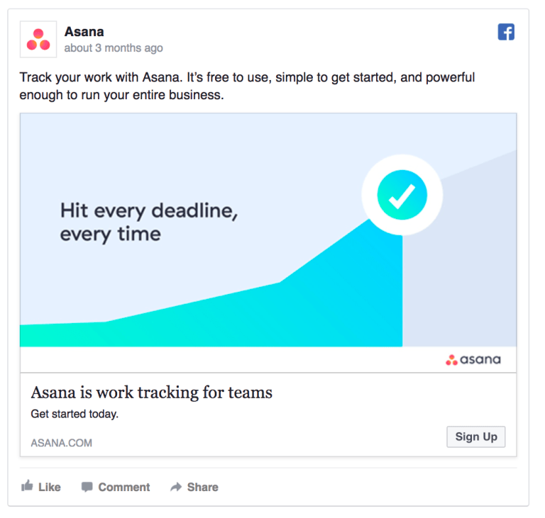
Asana
Why?
Bright colours always get your attention. Asana always manages to come up with really well blend colour combos which would instantly grab your attention. Colour psychology plays a massive part, colour combinations is probably the most important aspect of an ad and how it’s presented for the wide audience. Asana does it well with really bright colours.
#8 Adobe Stock

Adobe Stock
Why?
Stock Photo and an overlay text image of your logo. Adobe Stock’s logo stands out pretty well, doesn’t it? Make a dark background image, not necessarily a stock image and an overlay, the result? What you just saw above. Adobe know their stuff, we all know that.
#9 Kissmetrics
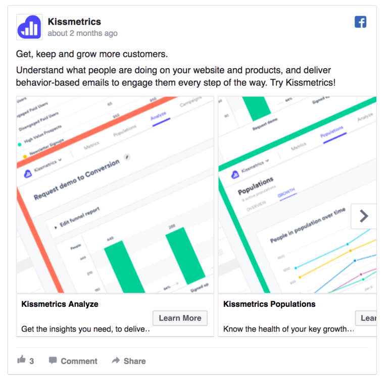
Kissmetrics
Why?
Specifically for their current and potential customers by getting hooked with their very first sentence – ‘Get, keep and grow more customers’. Followed by a selection of carousel.
#10 Hubspot

Hubspot
Why?
Highlighting their 20% discount above all. Let your audience know what you are offering, there isn’t a better option out there like Hubspot’s ad here.
#11 Grammarly
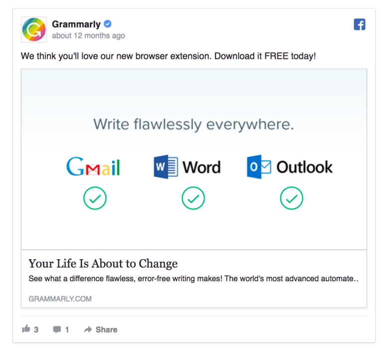
Grammarly
Why?
Highlights come from the text. ‘Your life is about to change’ – Grammarly is making a huge statement here and it definitely sparks an interest in our mind.
#12 Google

Why?
Google doesn’t necessarily need an ad to showcase their services. Instead, they want to make it all about you and remind you how much Google is doing for you. Put the customers first instead of prioritizing your company or brand. Results will follow.
#13 The Color Run

The Color Run
Why?
The Color Run focuses the Blue-White palette here which makes the text standout as well as the personalities in the ad. With not so much to explain, but you will get the picture just by taking a look at it and see their objective.
#14 Dropbox

Dropbox
Why?
Letting your potential customers know about the userbase of your product. The probability of x figure impressing you and even making you a step closer to use their service are significantly high compared to a brand you a relatively unknown of. Here Dropbox is letting you know that they are well established and respected by many businesses.
#15 Adidas

Adidas
Why?
There isn’t much happening here with Adidas’ Pharrell Williams’ sneakers here. Just being creative and elegant. You don’t need to overdo it to show the significance or beauty of a particular apparel or accessories.
#16 Upwork
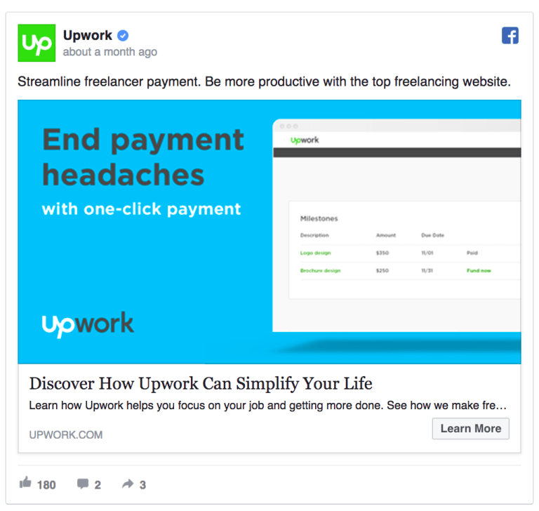
Upwork
Why?
Upwork is trying to take an action here. Slowly tilting the slide to their favour by helping users to solve a problem here with a solution, which is a service provided by Upwork.
#17 Marvel
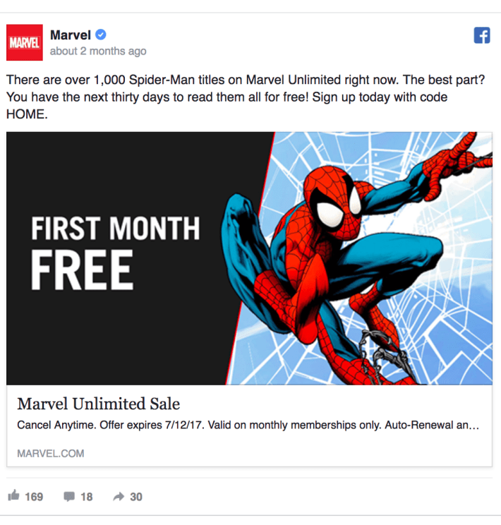
Marvel
Why?
Temptation. Phrases like ‘Free’, ‘Offer’ and more would land to your eyes without even knowing. Marvel is trying to highlight the biggest CTA strategy here with their membership features.
#18 Nike

Nike
Why?
Similar to Adidas. Not overcooking but highlighting their product with visual colours and the Nike branding.
#19 Jungle Scout

Jungle Scout
#20 Google Cloud

Google Cloud
#21 MailChimp
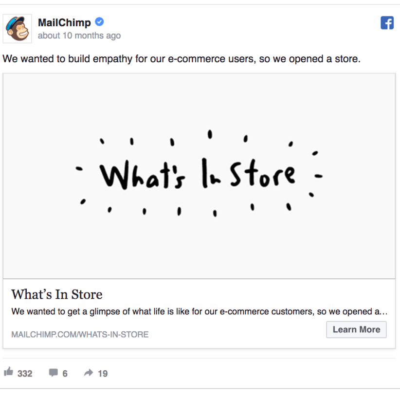
MailChimp
#22 Nike
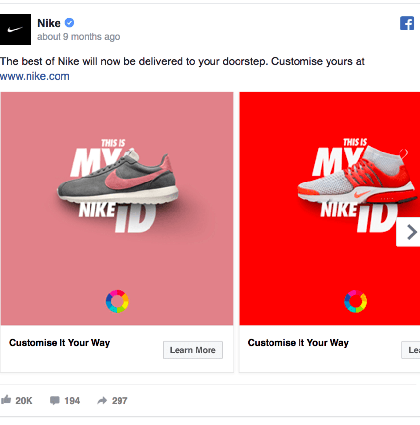
Nike
#23 Hired

Hired
#24 Juicero

Juicero
#25 Xero

Xero
#26 Canva
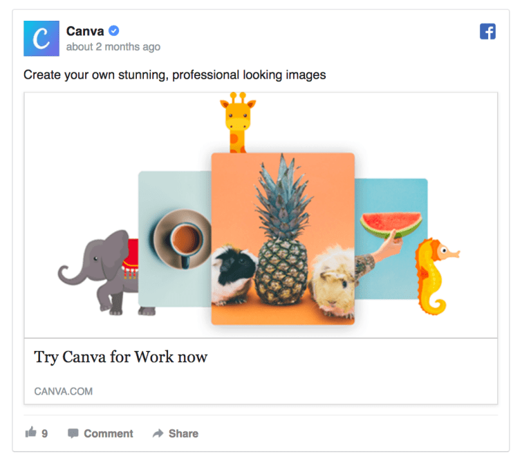
Canva
Why?
Simple and minimal with some really gorgeous colors which make it standout when laid on top of a white background. It’s the least we could expect from Canva.
#27 Zendesk

Zendesk
Why?
Going 100% minimal ain’t that bad it seems. Straight to the point, “Yeah, it’s us”. Wrap it up!
#28 Slack

Slack
Why?
A hybrid image of unicorns, rainbow, stars and a female model. Always do your best to speak in customer’s language like Slack doing right here with this ad. By highlighting customer’s problem and offering a solution is a genuine way of offering help through your ad.
#29 HelloFresh

HelloFresh
Why?
Here, the collage of different dish images adds even more vibrancy and contrast than if there was just one image, and all of the colours go along really well. Also giving an option to your audience to respond through three of the emojis options provided. The colours compliment each other.
Other note to be pointed would be incorporate the brand colour to the image with high quality. Don’t let them question your quality.
Hold these points tight.
Creating a landing page for your Facebook traffic to visit is integral to the success of your Facebook ad campaigns regardless of how much effort you put in and if the landing page sucks, that’s a breaking point for your potential customers. Use common image on both of them – landing page and the ad campaign.
According to Adespresso data, almost 70% of the marketers knew how much it would affect their business.
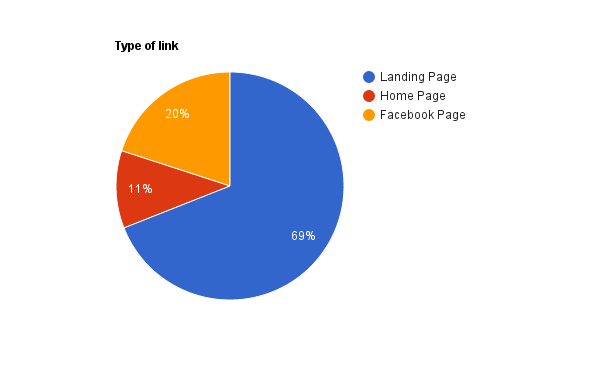
Adespresso chart
Here we can see 11% of the marketers are missing out on the potential customers with the lack of customized landing pages. Instead, they are redirecting the customers to their Home Page. So numbers prove to us that whatever you might be offering for, e-book, brochure, webinars, etc., your landing page should match the Facebook ad campaign.
Hopefully, these examples of some of the best Facebook ads we came up with managed to give some insights and inspiration as you take your next step in creating a new campaign. Your past experiences might have helped you learned your lessons as well when it didn’t work out like you hoped it would.
Quality over quantity. Make sure you come up with a bold headline and rich visual content by being short and engaging for your audience. As each day passes, it’s getting harder and harder for you to reach a particular goal with your Digital Marketing campaigns. Because no one is looking to do something new and risk worthy. Instead, they all try to follow the safe path like a leader in their industry. To make a huge leap in the final lap. Set the tone, take a different track from everyone else. The road less travelled leads you to better successful results.
Get in touch with Wishtree to pipe up your Facebook campaigns and bring ROI from your Facebook Dynamic ad campaigns.


Pingback: Marketing Technology Update August 2018 - HassleFree800
July 9, 2020 at 10:07 pmTrinity Church Spanish
September 26, 2021 at 3:39 am… [Trackback]
[…] Here you can find 90219 more Information on that Topic: wishtreeinfosolutions.com/facebook-ad-campaign-examples-to-follow/ […]
dark0de market
September 27, 2021 at 6:43 pm… [Trackback]
[…] Here you will find 85996 additional Information on that Topic: wishtreeinfosolutions.com/facebook-ad-campaign-examples-to-follow/ […]
buy 5-meo-dmt
September 30, 2021 at 12:23 pm… [Trackback]
[…] Find More here to that Topic: wishtreeinfosolutions.com/facebook-ad-campaign-examples-to-follow/ […]
Best place to buy psilocybe cubensis
October 17, 2021 at 12:19 am… [Trackback]
[…] Find More on that Topic: wishtreeinfosolutions.com/facebook-ad-campaign-examples-to-follow/ […]
so na buceta
October 19, 2021 at 8:31 am… [Trackback]
[…] Info to that Topic: wishtreeinfosolutions.com/facebook-ad-campaign-examples-to-follow/ […]
TKO Extracts is a recreational cannabis & Medical Marijuana Online Dispensary
October 20, 2021 at 11:55 am… [Trackback]
[…] Information on that Topic: wishtreeinfosolutions.com/facebook-ad-campaign-examples-to-follow/ […]
download liberado
October 27, 2021 at 3:30 am… [Trackback]
[…] Find More on that Topic: wishtreeinfosolutions.com/facebook-ad-campaign-examples-to-follow/ […]
paying social media jobs
November 10, 2021 at 6:04 am… [Trackback]
[…] Read More on that Topic: wishtreeinfosolutions.com/facebook-ad-campaign-examples-to-follow/ […]
nova88
November 13, 2021 at 6:30 am… [Trackback]
[…] Here you can find 7859 additional Info on that Topic: wishtreeinfosolutions.com/facebook-ad-campaign-examples-to-follow/ […]
sagame
November 13, 2021 at 8:47 am… [Trackback]
[…] Find More to that Topic: wishtreeinfosolutions.com/facebook-ad-campaign-examples-to-follow/ […]
dumps market
November 13, 2021 at 2:34 pm… [Trackback]
[…] Read More Information here to that Topic: wishtreeinfosolutions.com/facebook-ad-campaign-examples-to-follow/ […]
relx
November 18, 2021 at 7:01 am… [Trackback]
[…] Info on that Topic: wishtreeinfosolutions.com/facebook-ad-campaign-examples-to-follow/ […]
dispensary security
November 22, 2021 at 5:56 am… [Trackback]
[…] Find More on that Topic: wishtreeinfosolutions.com/facebook-ad-campaign-examples-to-follow/ […]
คาสิโนออนไลน์เว็บตรง
November 28, 2021 at 5:30 am… [Trackback]
[…] Find More on that Topic: wishtreeinfosolutions.com/facebook-ad-campaign-examples-to-follow/ […]
homes for sale in El Mirage AZ
December 1, 2021 at 6:18 am… [Trackback]
[…] Find More Information here to that Topic: wishtreeinfosolutions.com/facebook-ad-campaign-examples-to-follow/ […]
find-hookups.net/shemale-hookup/
December 7, 2021 at 12:33 am… [Trackback]
[…] Read More on that Topic: wishtreeinfosolutions.com/facebook-ad-campaign-examples-to-follow/ […]
sekabet giris
December 10, 2021 at 9:54 pm… [Trackback]
[…] Information on that Topic: wishtreeinfosolutions.com/facebook-ad-campaign-examples-to-follow/ […]
internet
December 14, 2021 at 5:46 am… [Trackback]
[…] Read More to that Topic: wishtreeinfosolutions.com/facebook-ad-campaign-examples-to-follow/ […]
1intersection
January 9, 2022 at 8:04 pm1autocratic
kardinal stick
January 10, 2022 at 6:28 am… [Trackback]
[…] Find More to that Topic: wishtreeinfosolutions.com/facebook-ad-campaign-examples-to-follow/ […]
3shapely
January 13, 2022 at 7:03 am2chronology
gay fetish video chat
January 14, 2022 at 3:56 pmgay advise chat https://bjsgaychatroom.info/
free dating webstes for gay men
January 14, 2022 at 7:51 pmfree gay dating in phoenix https://gaypridee.com/
free gay sex chat rooms
January 14, 2022 at 11:42 pmgay chat ru=oulette https://gaytgpost.com/
gay teen boy veido chat
January 15, 2022 at 2:52 amgay furry chat https://gay-buddies.com/
dumps with pin
January 15, 2022 at 1:42 pm… [Trackback]
[…] Read More here on that Topic: wishtreeinfosolutions.com/facebook-ad-campaign-examples-to-follow/ […]
best gay dating app
January 15, 2022 at 6:22 pminterracial dating gay https://speedgaydate.com/
free bonus slots
January 28, 2022 at 9:37 pmscatter slots characters https://2-free-slots.com/
free play slots online
January 29, 2022 at 2:35 amfree slots 777 sizzling 7s https://freeonlneslotmachine.com/
slim slots
January 29, 2022 at 5:20 amviva slots vegas free https://candylandslotmachine.com/
games slots
January 29, 2022 at 11:04 amfree hot slots https://pennyslotmachines.org/
gladiator slots
January 29, 2022 at 1:06 pmcaesars slots https://slotmachinesworld.com/
my konami slots
February 3, 2022 at 10:55 pmhorseshoe baltimore slots https://slotmachinesforum.net/
san manuel online slots
February 4, 2022 at 2:23 amvideo slots free https://slot-machine-sale.com/
charlestown slots
February 4, 2022 at 5:13 amquick hit slots facebook https://beat-slot-machines.com/
free slots real cash
February 4, 2022 at 8:59 amnms exocraft slots https://download-slot-machines.com/
mirror ball slots
February 4, 2022 at 1:25 pmdouble down free slots https://411slotmachine.com/
123 slots
February 4, 2022 at 3:06 pmkonami slots download https://www-slotmachines.com/
pop slots free chips
February 4, 2022 at 7:57 pmgold fish casino slots https://slotmachinegameinfo.com/
Jokes up exoticss
February 9, 2022 at 6:00 pm… [Trackback]
[…] Information to that Topic: wishtreeinfosolutions.com/facebook-ad-campaign-examples-to-follow/ […]
dissertation help tutors
February 11, 2022 at 12:26 amwriting acknowledgments dissertation https://buydissertationhelp.com/
dissertation help ireland my
February 11, 2022 at 7:49 pmstatistics help for dissertation https://dissertationwriting-service.com/
undergraduate dissertation
February 12, 2022 at 1:01 amonline dissertation writing services https://help-with-dissertations.com/
do dissertation writing services work
February 12, 2022 at 3:14 amcheap dissertation help in atlanta https://mydissertationwritinghelp.com/
mla dissertation citation
February 12, 2022 at 7:38 amsocial work dissertation help https://dissertations-writing.org/
doctoral dissertation help usa
February 12, 2022 at 11:15 amwhat does dissertation mean https://helpon-doctoral-dissertations.net/
https://graph.org/Omicron-Variant-Symptoms-Is-An-Excessive-Amount-Of-Mucus-A-COVID-19-Symptom-02-24
March 16, 2022 at 7:21 amCialis tadalafil https://graph.org/Omicron-Variant-Symptoms-Is-An-Excessive-Amount-Of-Mucus-A-COVID-19-Symptom-02-24
Awesome data. Cheers!
andere.strikingly.com
April 1, 2022 at 2:55 pmcialis tablets australia https://andere.strikingly.com/
Nicely put. Many thanks.
buy viagra now
April 4, 2022 at 11:20 pmcanadian pharmacies that ship to us https://keuybc.estranky.sk/clanky/30-facts-you-must-know–a-covid-cribsheet.html
Thank you, Lots of content.
https://gwertvb.mystrikingly.com/
April 5, 2022 at 7:06 pmcialis 20 mg best price https://gwertvb.mystrikingly.com/
You mentioned this very well.
telegra.phIs-It-Safe-To-Lift-COVID-19-Travel-Bans-04-06
April 6, 2022 at 9:45 pmcialis 5 mg https://telegra.ph/Is-It-Safe-To-Lift-COVID-19-Travel-Bans-04-06
You have made your stand very clearly!!
graph.orgThe-Way-To-Get-Health-Care-At-Home-During-COVID-19---Health--Fitness-04-07
April 8, 2022 at 11:15 pmcialis uk https://graph.org/The-Way-To-Get-Health-Care-At-Home-During-COVID-19—Health–Fitness-04-07
Great write ups. With thanks!
https://chubo3.wixsite.com/canadian-pharmacy/post/what-parents-must-find-out-about-kids-and-covid-19
April 9, 2022 at 5:16 pmcialis tablets https://chubo3.wixsite.com/canadian-pharmacy/post/what-parents-must-find-out-about-kids-and-covid-19
You have made your position quite well!!
canadian drug
April 9, 2022 at 11:53 pmcanadian government approved pharmacies https://canadian-pharmacies0.yolasite.com/
Nicely put. Thank you.
pharmacy-online.yolasite.com
April 10, 2022 at 5:08 pmtadalafil 20 mg https://pharmacy-online.yolasite.com/
You actually explained it well!
online canadian pharmacy
April 11, 2022 at 6:42 pmhighest rated canadian pharmacies https://kevasw.webgarden.com/
Really lots of awesome material.
https://62553dced4718.site123.me/
April 12, 2022 at 7:50 pmcialis tablets https://62553dced4718.site123.me/
Thanks a lot, Great stuff.
https://seketu.gonevis.com/high-10-tips-with-order-medicine-online-1/
April 13, 2022 at 8:19 pmcialis 5mg prix https://seketu.gonevis.com/high-10-tips-with-order-medicine-online-1/
You actually revealed that superbly.
https://site128620615.fo.team/
April 14, 2022 at 10:08 pmcialis lowest price https://site128620615.fo.team/
Thanks a lot. I like this.
https://625a9a98d5fa7.site123.me/blog/age-dependence-of-healthcare-interventions-for-covid-19-in-ontario-canada
April 16, 2022 at 9:08 pmpurchasing cialis on the internet https://625a9a98d5fa7.site123.me/blog/age-dependence-of-healthcare-interventions-for-covid-19-in-ontario-canada
You said it well.
https://hernswe.gonevis.com/scientists-model-true-prevalence-of-covid-19-throughout-pandemic/
April 17, 2022 at 7:50 amcialis tablets australia https://hernswe.gonevis.com/scientists-model-true-prevalence-of-covid-19-throughout-pandemic/
Regards. I like this.
selomns.gonevis.coma-modified-age-structured-sir-model-for-covid-19-type-viruses
April 17, 2022 at 6:44 pmcialis generic https://selomns.gonevis.com/a-modified-age-structured-sir-model-for-covid-19-type-viruses/
You have made the point!
trosorin.mystrikingly.com
April 20, 2022 at 4:41 amgeneric for cialis https://trosorin.mystrikingly.com/
Kudos, I like this.
https://sasnd0.wixsite.com/cialis/post/impotent-victims-can-now-cheer-up-try-generic-tadalafil-men-health
April 20, 2022 at 7:19 pmpurchasing cialis on the internet https://sasnd0.wixsite.com/cialis/post/impotent-victims-can-now-cheer-up-try-generic-tadalafil-men-health
Cheers, An abundance of postings.
https://626106aa4da69.site123.me/blog/new-step-by-step-roadmap-for-tadalafil-5mg
April 21, 2022 at 6:24 pmcialis 20 mg https://626106aa4da69.site123.me/blog/new-step-by-step-roadmap-for-tadalafil-5mg
You actually revealed this effectively!
https://generic-cialis-20-mg.yolasite.com/
April 22, 2022 at 8:36 pmbuy cialis without a doctor’s prescription https://generic-cialis-20-mg.yolasite.com/
Terrific information. Thank you.
hsoybn.estranky.skclankytadalafil-from-india-vs-brand-cialis---sexual-health.html
April 23, 2022 at 7:13 pmtadalafil https://hsoybn.estranky.sk/clanky/tadalafil-from-india-vs-brand-cialis—sexual-health.html
Thank you! A lot of stuff!
buy cheap cialis no prescription
April 25, 2022 at 5:12 pmcialis online https://skuvsbs.gonevis.com/when-tadalafil-5mg-competitors-is-good/
You made the point.
hemuyrt.livejournal.com325.html
April 26, 2022 at 7:39 amcialis pills https://hemuyrt.livejournal.com/325.html
Perfectly voiced truly! !
https://site373681070.fo.team/
April 26, 2022 at 7:28 pmcialis pills https://site373681070.fo.team/
You actually reported it terrifically!
https://sehytv.wordpress.com/
April 27, 2022 at 2:46 amGeneric cialis tadalafil https://sehytv.wordpress.com/
Regards, I enjoy this!
canada pharmacies online
April 27, 2022 at 9:30 pmcanadian rx https://ghswed.wordpress.com/2022/04/27/he-final-word-information-to-online-pharmacies/
Perfectly expressed genuinely! !
canadian pharmacy world
April 28, 2022 at 4:11 amcanadian pharmacies that ship to us https://kerbgsw.mystrikingly.com/
Beneficial advice. Thanks.
kuebser.estranky.skclankysupereasy-methods-to-study-every-part-about-online-medicine-order-discount.html
April 28, 2022 at 9:32 pmbuy generic cialis https://kuebser.estranky.sk/clanky/supereasy-methods-to-study-every-part-about-online-medicine-order-discount.html
Thanks a lot! A lot of material.
kewertyn.wordpress.com20220427expect-more-virtual-house-calls-out-of-your-doctor-thanks-to-telehealth-revolution
April 29, 2022 at 5:45 amcialis 20 mg https://kewertyn.wordpress.com/2022/04/27/expect-more-virtual-house-calls-out-of-your-doctor-thanks-to-telehealth-revolution/
Amazing tips. Cheers!
https://kerbiss.wordpress.com/2022/04/27/14/
April 29, 2022 at 6:15 pmcialis without a doctor’s prescription https://kerbiss.wordpress.com/2022/04/27/14/
Cheers. I enjoy this!
https://heswcxc.wordpress.com/2022/04/30/online-medicine-tablets-shopping-promotion-one-hundred-and-one/
April 30, 2022 at 9:19 pmcialis without a doctor’s prescription https://heswcxc.wordpress.com/2022/04/30/online-medicine-tablets-shopping-promotion-one-hundred-and-one/
Good material. With thanks.
global pharmacy canada
May 1, 2022 at 7:14 pmbuy viagra usa https://sernert.estranky.sk/clanky/confidential-information-on-online-pharmacies.html
Amazing loads of amazing facts!
canadian discount pharmacies
May 2, 2022 at 6:12 amnorthwestpharmacy https://kertubs.mystrikingly.com/
Awesome information. Cheers!
626f977eb31c9.site123.mebloghow-google-is-changing-how-we-approach-online-order-medicine-1
May 2, 2022 at 7:48 pmcialis prices https://626f977eb31c9.site123.me/blog/how-google-is-changing-how-we-approach-online-order-medicine-1
Cheers, I like it.
online drug store
May 3, 2022 at 1:53 amcanadian pharmacies that ship to us https://canadian-pharmaceuticals-online.yolasite.com/
Thanks a lot. A good amount of postings!
https://online-pharmacies0.yolasite.com/
May 3, 2022 at 6:46 pmcanadian cialis https://online-pharmacies0.yolasite.com/
Helpful material. Thanks a lot.
6270e49a4db60.site123.meblogthe-untold-secret-to-mastering-aspirin-in-just-7-days-1
May 4, 2022 at 2:04 amtadalafil without a doctor’s prescription https://6270e49a4db60.site123.me/blog/the-untold-secret-to-mastering-aspirin-in-just-7-days-1
Terrific stuff. Appreciate it.
https://deiun.flazio.com/
May 4, 2022 at 8:28 pmcialis 5mg https://deiun.flazio.com/
Thank you! Lots of data!
https://kertyun.flazio.com/
May 5, 2022 at 5:00 amtadalafil https://kertyun.flazio.com/
Lovely material. Cheers.
kwsedc.iwopop.com
July 19, 2022 at 5:46 pmcialis lowest price http://kwsedc.iwopop.com/
With thanks! Numerous write ups.
safe canadian online pharmacies
July 20, 2022 at 12:21 amcanadian pharmacy uk delivery http://kwerks.iwopop.com/
Regards, Very good stuff!
drugscanada.teachable.com
July 20, 2022 at 6:25 amcialis generico https://drugscanada.teachable.com/
You made your position pretty well.!
film
July 20, 2022 at 2:48 pmfilm
film
https://selaw.flazio.com/
July 20, 2022 at 4:43 pmtadalafil 20 mg https://selaw.flazio.com/
Truly loads of very good tips.
gswera.livejournal.com385.html
July 21, 2022 at 12:40 amcialis 20mg https://gswera.livejournal.com/385.html
You expressed this perfectly!
canadianpharmaceutical.bigcartel.comcanadian-pharmaceuticals-online
July 21, 2022 at 6:42 amcialis online https://canadianpharmaceutical.bigcartel.com/canadian-pharmaceuticals-online
Very good advice. Appreciate it.
https://azuvh4.wixsite.com/pharmaceuticals-onli/post/london-drugs-canada
July 21, 2022 at 8:46 pmtadalafil https://azuvh4.wixsite.com/pharmaceuticals-onli/post/london-drugs-canada
Excellent material. Many thanks.
https://hub.docker.com/r/pharmacies/online
July 22, 2022 at 7:01 amcialis from canada https://hub.docker.com/r/pharmacies/online
You’ve made your point.
list of reputable canadian pharmacies
July 22, 2022 at 3:19 pmdrugs for sale https://www.formlets.com/forms/N2BtJ3kPeJ3KclCw/
Nicely put, Thanks a lot.
canadian pharmacies
July 22, 2022 at 11:28 pmpharmacy canada https://www.divephotoguide.com/user/pharmacies
You said it adequately.!
hkwerf.micro.blog
July 23, 2022 at 5:35 pmcialis https://hkwerf.micro.blog/
Thanks a lot! Quite a lot of posts.
my.desktopnexus.comCanadian-pharmaciesjournalsafe-canadian-online-pharmacies-38571
July 23, 2022 at 11:26 pmtadalafil without a doctor’s prescription https://my.desktopnexus.com/Canadian-pharmacies/journal/safe-canadian-online-pharmacies-38571/
Very good data. Many thanks!
https://canadian-government-approved-pharmacies.webflow.io/
July 24, 2022 at 6:34 amtadalafil 5mg https://canadian-government-approved-pharmacies.webflow.io/
With thanks! Quite a lot of advice.
online pharmacy canada
July 25, 2022 at 7:00 pmbuy viagra usa https://lasevs.estranky.cz/clanky/pharmaceuticals-online-australia.html
Kudos, I enjoy it!
https://kawerc.proweb.cz/
July 26, 2022 at 1:21 ambuy cialis https://kawerc.proweb.cz/
Many thanks! Plenty of posts.
pedrew.zombeek.cz
July 26, 2022 at 7:04 amcialis from canada https://pedrew.zombeek.cz/
Many thanks. I enjoy it!
fermser.flazio.com
July 27, 2022 at 9:55 pmcialis from canada https://fermser.flazio.com/
Regards! I like it!
canadian prescriptions online
July 28, 2022 at 4:11 ambuy viagra usa https://londondrugscanada.bigcartel.com/london-drugs
Thanks. A good amount of advice.
Canadian Pharmacy USA
July 28, 2022 at 3:21 pmcanadian online pharmacies https://canadapharmacy.teachable.com/
Thanks, Plenty of data.
https://my.desktopnexus.com/kawemn/journal/pharmaceuticals-online-australia-38678/
July 30, 2022 at 2:14 pmcialis 5mg https://my.desktopnexus.com/kawemn/journal/pharmaceuticals-online-australia-38678/
Superb material. Appreciate it.
https://www.divephotoguide.com/user/drugs
July 30, 2022 at 8:12 pmtadalafil generic https://www.divephotoguide.com/user/drugs
Cheers, Awesome information.
https://hub.docker.com/r/dkwer/drugs
July 31, 2022 at 2:18 amcialis canada https://hub.docker.com/r/dkwer/drugs
Truly a good deal of good facts!
canadian viagra
July 31, 2022 at 8:45 pmnorthwestpharmacy https://form.jotform.com/decote/canadian-pharmacies-shipping-to-the
You actually stated that exceptionally well!
linktr.eecanadianpharmacy
August 1, 2022 at 5:06 amcialis 20 mg best price https://linktr.ee/canadianpharmacy
Nicely put. Thank you!
canadian pharmacies shipping to usa
August 2, 2022 at 5:05 pmbuy viagra now https://kawers.micro.blog/
Terrific forum posts. Many thanks.
https://mewser.mystrikingly.com/
August 4, 2022 at 3:51 pmgeneric cialis https://mewser.mystrikingly.com/
Thank you. Plenty of advice!
sbwerd.estranky.skclankycialis-generic-pharmacy-online.html
August 4, 2022 at 9:40 pmtadalafil generic https://sbwerd.estranky.sk/clanky/cialis-generic-pharmacy-online.html
Nicely put. With thanks.
alewrt.flazio.com
August 5, 2022 at 4:36 amonline prescriptions without a doctor https://alewrt.flazio.com/
Whoa quite a lot of superb data!
buy cialis usa
August 5, 2022 at 3:46 pmtadalafil 10 mg https://buycialisonline.fo.team/
You said it perfectly.!
buy cialis pills online
August 6, 2022 at 3:56 pmtadalafil tablets https://laswert.wordpress.com/
Wow all kinds of valuable info.
https://kasheras.livejournal.com/283.html
August 7, 2022 at 1:48 amcialis canada https://kasheras.livejournal.com/283.html
Effectively voiced genuinely! !
https://kwxcva.estranky.cz/clanky/cialis-20-mg.html
August 7, 2022 at 8:04 pmcialis 5 mg https://kwxcva.estranky.cz/clanky/cialis-20-mg.html
Regards, A lot of data.
buy cialis us pharmacy
August 8, 2022 at 2:44 amcialis 5 mg https://tadalafil20mg.proweb.cz/
Wonderful stuff. Thanks a lot!
https://owzpkg.zombeek.cz/
August 8, 2022 at 3:21 pmpurchasing cialis on the internet https://owzpkg.zombeek.cz/
Cheers! Helpful information!
lasweb.iwopop.com
August 8, 2022 at 11:07 pmcialis 20mg http://lasweb.iwopop.com/
Truly tons of awesome material.
buy cialis no rx
August 9, 2022 at 5:34 amtadalafil https://buycialisonline.bigcartel.com/cialis-without-a-doctor-prescription
With thanks. I appreciate it!
buy cialis online without a prescription
August 9, 2022 at 3:07 pmcialis from canada https://buycialisonline.teachable.com/
Nicely put, Thanks a lot.
kalwer.micro.blog
August 9, 2022 at 10:26 pmcialis without a doctor’s prescription https://kalwer.micro.blog/
Seriously loads of very good info.
https://my.desktopnexus.com/Buycialis/journal/cialis-without-a-doctor-prescription-38780/
August 10, 2022 at 3:00 pmbuy generic cialis https://my.desktopnexus.com/Buycialis/journal/cialis-without-a-doctor-prescription-38780/
You expressed that wonderfully.
buy cialis online us pharmacy
August 10, 2022 at 10:56 pmcialis generico https://www.divephotoguide.com/user/buycialisonline
Thanks. I enjoy it!
https://hub.docker.com/r/tadalafil/20mg
August 11, 2022 at 2:46 pmcialis 5mg https://hub.docker.com/r/tadalafil/20mg
You definitely made your point!
https://tadalafil20mg.webflow.io/
August 11, 2022 at 10:48 pmcialis purchase online without prescription https://tadalafil20mg.webflow.io/
Great tips. Cheers.
buy cialis with no prescription
August 12, 2022 at 3:58 pmcialis online https://kswbnh.nethouse.ru/
Good forum posts. Thanks.
buy cheap cialis no prescription
August 12, 2022 at 8:37 pmcialis 5 mg https://www.formlets.com/forms/fpN4Ll8AEnDHBAkr/
Awesome stuff. Many thanks!
buy cialis online without a prescription
August 13, 2022 at 2:22 pmcialis lowest price https://form.jotform.com/ogmyn/buycialisonline
Effectively spoken certainly. !
buy cialis no rx
August 13, 2022 at 6:04 pmcialis from canada https://linktr.ee/buycialisonline
Many thanks! Numerous stuff.
telegra.phCialis-20mg-08-13
August 13, 2022 at 9:58 pmcialis pills https://telegra.ph/Cialis-20mg-08-13
Fine advice. With thanks!
graph.orgTadalafil-20mg-08-13
August 14, 2022 at 1:37 amcialis purchase online without prescription https://graph.org/Tadalafil-20mg-08-13
You stated that adequately.
pharmacy
August 14, 2022 at 11:32 amCanadian Pharmacy USA https://kwenzx.nethouse.ru/
You definitely made your point!
https://dwerks.nethouse.ru/
August 14, 2022 at 3:01 pmCialis tadalafil https://dwerks.nethouse.ru/
Thanks, I like this!
form.jotform.comycaatkcanadian-pharmaceuticals-online-lis
August 14, 2022 at 7:41 pmbuy generic cialis https://form.jotform.com/ycaatk/canadian-pharmaceuticals-online-lis
Fantastic postings, With thanks.
https://linktr.ee/onlinepharmacies
August 15, 2022 at 3:27 amgeneric cialis https://linktr.ee/onlinepharmacies
Fantastic forum posts. Kudos!
prescription drugs without prior prescription
August 15, 2022 at 11:39 amcanadian prescription drugstore https://telegra.ph/Reputable-canadian-pharmaceuticals-online-08-12
Incredible lots of terrific material.
https://graph.org/Pharmacies-in-canada-shipping-to-usa-08-12
August 15, 2022 at 3:31 pmtadalafil without a doctor’s prescription https://graph.org/Pharmacies-in-canada-shipping-to-usa-08-12
Regards, Loads of material!
telegra.phRecommended-canadian-pharmacies-08-12
August 15, 2022 at 7:22 pmcialis 20 mg https://telegra.ph/Recommended-canadian-pharmacies-08-12
Very good information. Cheers!
graph.orgSafe-canadian-online-pharmacies-08-12
August 15, 2022 at 11:23 pmonline cialis https://graph.org/Safe-canadian-online-pharmacies-08-12
Awesome stuff. Cheers!
https://linktr.ee/canadianpharmacies
August 16, 2022 at 4:34 amgeneric for cialis https://linktr.ee/canadianpharmacies
Nicely put. Kudos!
https://buyviagraonlinee.mystrikingly.com/
August 16, 2022 at 2:41 pmCialis tadalafil https://buyviagraonlinee.mystrikingly.com/
Regards. I enjoy it!
https://buyviagraonline.estranky.sk/clanky/buy-viagra-without-prescription-pharmacy-online.html
August 16, 2022 at 6:07 pmonline prescriptions without a doctor https://buyviagraonline.estranky.sk/clanky/buy-viagra-without-prescription-pharmacy-online.html
Excellent tips. With thanks!
buyviagraonline.flazio.com
August 16, 2022 at 9:53 pmcialis https://buyviagraonline.flazio.com/
You made your point.
buy viagra
August 17, 2022 at 1:50 amViagra manufacturer coupon https://buyviagraonline.fo.team/
Nicely put. Appreciate it.
buy generic viagra online
August 17, 2022 at 12:10 pmViagra 5mg prix https://noyano.wixsite.com/buyviagraonline
Regards, Lots of advice.
buyviagraonlinet.wordpress.com
August 17, 2022 at 4:32 pmcialis lowest price https://buyviagraonlinet.wordpress.com/
Lovely information. Thanks.
buy cheap viagra no prescription
August 17, 2022 at 8:05 pmDiscount viagra https://buyviagraonl.livejournal.com/386.html
Thanks, Very good information!
buy viagra cheap
August 18, 2022 at 12:02 amViagra 5 mg https://buyviagraonline.nethouse.ru/
Beneficial forum posts. With thanks.
buyviagraonline.estranky.czclankycan-i-buy-viagra-without-prescription.html
August 18, 2022 at 3:58 ammedication without a doctors prescription https://buyviagraonline.estranky.cz/clanky/can-i-buy-viagra-without-prescription.html
Good postings, Kudos!
buyviagraonline.proweb.cz
August 18, 2022 at 12:10 pmCialis tadalafil https://buyviagraonline.proweb.cz/
With thanks, Terrific stuff!
buy viagra online safely
August 18, 2022 at 4:12 pmViagra kaufen https://buyviagraonline.zombeek.cz/
You actually expressed that well.
jso7c59f304.iwopop.com
August 18, 2022 at 7:43 pmgeneric for cialis http://jso7c59f304.iwopop.com/
You said it very well.!
buy viagra with no prescription
August 20, 2022 at 2:16 pmViagra for sale https://buyviagraonline.bigcartel.com/viagra-without-a-doctor-prescription
Thank you. Numerous posts!
buyviagraonline.teachable.com
August 20, 2022 at 6:08 pmtadalafil 20 mg https://buyviagraonline.teachable.com/
Nicely put, Cheers.
telegra.phHow-to-get-viagra-without-a-doctor-08-18
August 20, 2022 at 9:37 pmcialis 20mg prix en pharmacie https://telegra.ph/How-to-get-viagra-without-a-doctor-08-18
Cheers. Very good stuff.
graph.orgBuying-viagra-without-a-prescription-08-18
August 21, 2022 at 1:44 amGeneric cialis tadalafil https://graph.org/Buying-viagra-without-a-prescription-08-18
Seriously all kinds of great information.
buy viagra pills
August 21, 2022 at 1:48 pmLow cost viagra 20mg https://buyviagraonline.micro.blog/
You revealed this wonderfully!
https://my.desktopnexus.com/buyviagraonline/journal/online-viagra-without-a-prescriptuon-38932/
August 21, 2022 at 5:33 pmtadalafil tablets https://my.desktopnexus.com/buyviagraonline/journal/online-viagra-without-a-prescriptuon-38932/
You actually reported it terrifically!
buy viagra no rx
August 21, 2022 at 9:06 pmViagra prices https://www.divephotoguide.com/user/buyviagraonline
You mentioned this superbly!
buy cheap viagra in canada
August 22, 2022 at 1:02 amBuy generic viagra https://hub.docker.com/r/buyviagraonline/viagra
Great data, Kudos.
where to buy viagra online
August 22, 2022 at 1:45 pmBuy generic viagra https://viagrawithoutprescription.webflow.io/
You’ve made your point very clearly..
form.jotform.com222341315941044
August 23, 2022 at 2:14 pmbuy cialis without a doctor’s prescription https://form.jotform.com/222341315941044
You definitely made the point.
linktr.eebuyviagraonline
August 23, 2022 at 6:03 pmtadalafil without a doctor’s prescription https://linktr.ee/buyviagraonline
Many thanks, Quite a lot of stuff!
buyviagraonline.home.blog
August 23, 2022 at 9:27 pmcialis 20 mg best price https://buyviagraonline.home.blog/
Incredible many of superb data.
canadianpharmaceuticalsonline.home.blog
August 24, 2022 at 1:09 amcialis 20mg prix en pharmacie https://canadianpharmaceuticalsonline.home.blog/
Amazing material. Thanks!
buy viagra germany
August 29, 2022 at 4:15 amCheap viagra https://onlineviagra.mystrikingly.com/
You actually explained that perfectly!
https://reallygoodemails.com/onlineviagra
August 29, 2022 at 4:58 pmcialis generico https://reallygoodemails.com/onlineviagra
Incredible lots of very good tips!
viagraonline.estranky.skclankyviagra-without-prescription.html
August 29, 2022 at 10:23 pmcialis https://viagraonline.estranky.sk/clanky/viagra-without-prescription.html
Appreciate it. Lots of info!
buy viagra medication
August 30, 2022 at 2:14 amViagra kaufen https://viagraonlineee.wordpress.com/
With thanks! Awesome stuff.
https://viagraonline.home.blog/
August 30, 2022 at 12:48 pmgeneric cialis https://viagraonline.home.blog/
Regards, Lots of info.
viagraonlinee.livejournal.com492.html
August 30, 2022 at 3:54 pmgeneric cialis https://viagraonlinee.livejournal.com/492.html
Really loads of helpful facts.
https://onlineviagra.flazio.com/
August 30, 2022 at 7:02 pmcialis 5mg https://onlineviagra.flazio.com/
You actually reported that wonderfully.
onlineviagra.fo.team
August 31, 2022 at 1:01 amcialis 20 mg https://onlineviagra.fo.team/
Nicely put. With thanks.
https://www.kadenze.com/users/canadian-pharmaceuticals-for-usa-sales
September 2, 2022 at 11:48 pmcialis 20mg https://www.kadenze.com/users/canadian-pharmaceuticals-for-usa-sales
Nicely put. Many thanks.
canadian pharmacy cialis
September 3, 2022 at 2:38 pmglobal pharmacy canada https://linktr.ee/canadianpharmaceuticalsonline
Kudos, A good amount of tips.
disqus.comhomeforumcanadian-pharmaceuticals-online
September 3, 2022 at 7:08 pmcanadian cialis https://disqus.com/home/forum/canadian-pharmaceuticals-online/
You stated this well.
500px.compcanadianpharmaceuticalsonline
September 4, 2022 at 1:17 amtadalafil 5mg https://500px.com/p/canadianpharmaceuticalsonline
You definitely made your point.
dailygram.comindex.phpblog1155353we-know-quite-a-bit-about-covid-19
September 4, 2022 at 10:57 pmcialis pills https://dailygram.com/index.php/blog/1155353/we-know-quite-a-bit-about-covid-19/
Seriously a lot of awesome knowledge!
viagra canada
September 5, 2022 at 6:35 amcanadian drugstore https://challonge.com/en/canadianpharmaceuticalsonlinemt
You said it nicely.!
500px.complistofcanadianpharmaceuticalsonline
September 5, 2022 at 3:16 pmCheap cialis https://500px.com/p/listofcanadianpharmaceuticalsonline
You actually suggested it really well!
www.seje.gov.mzquestioncanadian-pharmacies-shipping-to-usa
September 5, 2022 at 7:51 pmcialis without a doctor’s prescription https://www.seje.gov.mz/question/canadian-pharmacies-shipping-to-usa/
Many thanks. A good amount of knowledge.
canadian pharmaceuticals
September 6, 2022 at 12:43 amcanadian drug https://challonge.com/en/canadianpharmaciesshippingtousa
You said it very well.!
https://challonge.com/en/canadianpharmaceuticalsonlinetousa
September 6, 2022 at 12:53 pmcialis canada https://challonge.com/en/canadianpharmaceuticalsonlinetousa
You said it very well..
https://pinshape.com/users/2441403-canadian-pharmaceuticals-online
September 6, 2022 at 8:16 pmmedication without a doctors prescription https://pinshape.com/users/2441403-canadian-pharmaceuticals-online
Seriously a lot of helpful information.
www.scoop.ittopiccanadian-pharmaceuticals-online
September 7, 2022 at 12:37 amtadalafil generic https://www.scoop.it/topic/canadian-pharmaceuticals-online
With thanks! Helpful stuff!
https://reallygoodemails.com/canadianpharmaceuticalsonline
September 7, 2022 at 4:43 amcialis 5 mg https://reallygoodemails.com/canadianpharmaceuticalsonline
With thanks. Excellent stuff.
pinshape.com/users/2441621-canadian-pharmaceutical-companies
September 7, 2022 at 1:10 pmmedication without a doctors prescription pinshape.com/users/2441621-canadian-pharmaceutical-companies
With thanks. Helpful information!
https://pinshape.com/users/2441621-canadian-pharmaceutical-companies
September 7, 2022 at 7:05 pmbuy generic cialis https://pinshape.com/users/2441621-canadian-pharmaceutical-companies
Nicely put, Thank you.
best canadian pharmacy
September 7, 2022 at 11:14 pmonline canadian pharmacies https://reallygoodemails.com/canadianpharmaceuticalcompanies
Wow quite a lot of awesome facts!
buying stromectol online
September 9, 2022 at 5:29 pmstromectol canada https://pinshape.com/users/2445987-order-stromectol-over-the-counter
Kudos. An abundance of information!
reallygoodemails.comorderstromectoloverthecounter
September 9, 2022 at 10:09 pmViagra bula https://reallygoodemails.com/orderstromectoloverthecounter
Nicely put. Kudos.
stromectol tablets
September 10, 2022 at 4:07 pmstromectol uk https://challonge.com/en/orderstromectoloverthecounter
Thanks, Useful information!
https://500px.com/p/orderstromectoloverthecounter
September 10, 2022 at 7:54 pmViagra kaufen https://500px.com/p/orderstromectoloverthecounter
Thanks a lot, Terrific information!
www.seje.gov.mzquestionorder-stromectol-over-the-counter-6
September 11, 2022 at 3:47 amViagra alternative https://www.seje.gov.mz/question/order-stromectol-over-the-counter-6/
Truly a lot of amazing information!
https://canadajobscenter.com/author/buystromectol/
September 11, 2022 at 2:20 pmViagra canada https://canadajobscenter.com/author/buystromectol/
Thanks a lot! I like it.
https://canadajobscenter.com/author/canadianpharmaceuticalsonline/
September 11, 2022 at 5:54 pmGeneric for viagra https://canadajobscenter.com/author/canadianpharmaceuticalsonline/
Info effectively applied..
cialis from canada
September 11, 2022 at 9:40 pmNorthwest Pharmacy https://aoc.stamford.edu/profile/canadianpharmaceuticalsonline/
Truly a good deal of amazing information.
https://canadianpharmaceuticalsonline.bandcamp.com/releases
September 12, 2022 at 2:42 pmViagra bula https://canadianpharmaceuticalsonline.bandcamp.com/releases
Very good stuff, Appreciate it.
https://ktqt.ftu.edu.vn/en/question list/canadian-pharmaceuticals-for-usa-sales/
September 13, 2022 at 1:50 amHow does viagra work https://ktqt.ftu.edu.vn/en/question list/canadian-pharmaceuticals-for-usa-sales/
Thanks, A good amount of forum posts.
https://www.provenexpert.com/canadian-pharmaceuticals-online/
September 13, 2022 at 4:08 pmViagra or viagra https://www.provenexpert.com/canadian-pharmaceuticals-online/
Amazing a lot of great data!
aoc.stamford.eduprofileStromectol
September 13, 2022 at 10:05 pmViagra for sale https://aoc.stamford.edu/profile/Stromectol/
Thank you, I enjoy it.
https://ktqt.ftu.edu.vn/en/question list/order-stromectol-over-the-counter-10/
September 14, 2022 at 2:00 amViagra coupon https://ktqt.ftu.edu.vn/en/question list/order-stromectol-over-the-counter-10/
Really many of beneficial material.
https://orderstromectoloverthecounter.bandcamp.com/releases
September 14, 2022 at 1:36 pmViagra 20mg https://orderstromectoloverthecounter.bandcamp.com/releases
Many thanks! I like this.
www.provenexpert.comorder-stromectol-over-the-counter12
September 14, 2022 at 5:09 pmViagra generika https://www.provenexpert.com/order-stromectol-over-the-counter12/
You’ve made your point!
www.repairanswers.netquestionorder-stromectol-over-the-counter-2
September 14, 2022 at 10:06 pmViagra 5 mg funziona https://www.repairanswers.net/question/order-stromectol-over-the-counter-2/
Thank you. Fantastic information!
www.repairanswers.netquestionstromectol-order-online
September 16, 2022 at 3:17 pmViagra for sale https://www.repairanswers.net/question/stromectol-order-online/
Thank you, Lots of tips.
https://canadajobscenter.com/author/arpreparof1989/
September 16, 2022 at 7:11 pmCanadian viagra https://canadajobscenter.com/author/arpreparof1989/
You stated it wonderfully!
https://aoc.stamford.edu/profile/goatunmantmen/
September 17, 2022 at 6:32 pmOnline viagra https://aoc.stamford.edu/profile/goatunmantmen/
Very good info, Kudos.
how much does stromectol cost
September 18, 2022 at 12:31 amivermectin for humans https://web904.com/stromectol-buy/
You actually revealed it effectively.
stromectol tablets
September 18, 2022 at 5:40 pmivermectin tablets https://web904.com/buy-ivermectin-online-fitndance/
You actually revealed that fantastically.
https://glycvimepedd.bandcamp.com/releases
September 18, 2022 at 9:09 pmGeneric viagra https://glycvimepedd.bandcamp.com/releases
Truly loads of excellent data.
canadajobscenter.comauthorereswasint
September 19, 2022 at 6:36 pmViagra or viagra https://canadajobscenter.com/author/ereswasint/
Wonderful content, Appreciate it.
https://aoc.stamford.edu/profile/hispennbackwin/
September 19, 2022 at 11:08 pmViagra generique https://aoc.stamford.edu/profile/hispennbackwin/
Many thanks, I like it!
canadian medications
September 20, 2022 at 2:53 amlegitimate canadian mail order pharmacies https://bursuppsligme.bandcamp.com/releases
You reported that well!
pinshape.comusers2461310-canadian-pharmacies-shipping-to-usa
September 20, 2022 at 3:48 pmCanadian viagra https://pinshape.com/users/2461310-canadian-pharmacies-shipping-to-usa
Thanks a lot. Numerous facts!
medicament stromectol
September 20, 2022 at 7:30 pmstromectol cream https://pinshape.com/users/2462760-order-stromectol-over-the-counter
You reported this exceptionally well.
stromectol brasilien
September 20, 2022 at 11:49 pmstromectol medication https://pinshape.com/users/2462910-order-stromectol-online
You actually suggested that effectively.
500px.com/p/phraspilliti
September 21, 2022 at 8:26 pmViagra tablets australia 500px.com/p/phraspilliti
Seriously lots of beneficial info!
https://web904.com/canadian-pharmaceuticals-for-usa-sales/
September 22, 2022 at 2:15 pmGeneric viagra https://web904.com/canadian-pharmaceuticals-for-usa-sales/
Amazing lots of fantastic material!
stromectol australia
September 23, 2022 at 3:52 pmstromectol biam https://500px.com/p/skulogovid/?view=groups
Thanks a lot. A lot of write ups.
500px.compbersavahi?view=groups
September 23, 2022 at 7:52 pmViagra purchasing https://500px.com/p/bersavahi/?view=groups
Nicely put, Thanks a lot.
https://reallygoodemails.com/canadianpharmaceuticalsonlineusa
September 24, 2022 at 1:01 pmViagra tablets australia https://reallygoodemails.com/canadianpharmaceuticalsonlineusa
Amazing a good deal of great knowledge!
https://www.provenexpert.com/canadian-pharmaceuticals-online-usa/
September 24, 2022 at 4:35 pmViagra canada https://www.provenexpert.com/canadian-pharmaceuticals-online-usa/
Seriously plenty of useful knowledge.
https://sanangelolive.com/members/pharmaceuticals
September 24, 2022 at 9:41 pmViagra great britain https://sanangelolive.com/members/pharmaceuticals
Nicely put, Many thanks.
canadian online pharmacy
September 26, 2022 at 8:42 pmonline canadian pharmacies https://melaninterest.com/user/canadian-pharmaceuticals-online/?view=likes
Incredible many of great tips!
haikudeck.comcanadian-pharmaceuticals-online-personal-presentation-827506e003
September 27, 2022 at 12:42 amViagra generico online https://haikudeck.com/canadian-pharmaceuticals-online-personal-presentation-827506e003
Kudos, Useful stuff.
https://buyersguide.americanbar.org/profile/420642/0
September 27, 2022 at 4:50 amCheap viagra https://buyersguide.americanbar.org/profile/420642/0
You actually mentioned it superbly!
discount canadian pharmacies
September 27, 2022 at 12:31 pmpharmacy https://experiment.com/users/canadianpharmacy
Thanks, Terrific stuff!
pharmacy canada
September 27, 2022 at 6:29 pmcanada viagra https://slides.com/canadianpharmaceuticalsonline
You have made your stand pretty well!.
https://challonge.com/esapenti
September 27, 2022 at 10:10 pmViagra generico online https://challonge.com/esapenti
Lovely stuff, Regards.
challonge.comgotsembpertvil
September 28, 2022 at 2:36 amViagra 20 mg https://challonge.com/gotsembpertvil
Thanks! I enjoy it.
challonge.comcitlitigolf
September 28, 2022 at 4:19 pmTadalafil https://challonge.com/citlitigolf
Terrific info. Thanks.
stromectol dosage table
September 28, 2022 at 7:52 pmstromectol mites https://order-stromectol-over-the-counter.estranky.cz/clanky/order-stromectol-over-the-counter.html
Thanks! Numerous forum posts.
https://soncheebarxu.estranky.cz/clanky/stromectol-for-head-lice.html
September 29, 2022 at 2:18 amViagra tablets https://soncheebarxu.estranky.cz/clanky/stromectol-for-head-lice.html
Fine knowledge. Appreciate it!
https://lehyriwor.estranky.sk/clanky/stromectol-cream.html
September 29, 2022 at 3:49 pmLow cost viagra 20mg https://lehyriwor.estranky.sk/clanky/stromectol-cream.html
You’ve made your position quite effectively..
ivermectin
September 29, 2022 at 7:36 pmbuying stromectol online https://dsdgbvda.zombeek.cz/
Many thanks! Valuable information.
https://inflavnena.zombeek.cz/
September 30, 2022 at 2:05 amViagra dosage https://inflavnena.zombeek.cz/
With thanks. Terrific stuff!
www.myscrsdirectory.comprofile4217080
September 30, 2022 at 8:19 pmViagra or viagra https://www.myscrsdirectory.com/profile/421708/0
With thanks, Awesome information!
https://supplier.ihrsa.org/profile/421717/0
October 1, 2022 at 3:33 am5 mg viagra coupon printable https://supplier.ihrsa.org/profile/421717/0
Regards. Lots of info!
legitimate canadian mail order pharmacies
October 1, 2022 at 5:52 pmcanadian drugstore https://wefbuyersguide.wef.org/profile/421914/0
Terrific forum posts. Appreciate it!
https://legalmarketplace.alanet.org/profile/421920/0
October 1, 2022 at 9:56 pmCheap viagra https://legalmarketplace.alanet.org/profile/421920/0
This is nicely expressed! !
canadian pharmacys
October 2, 2022 at 3:30 pmcanadian drug https://moaamein.nacda.com/profile/422018/0
Kudos! Quite a lot of info!
canadian pharmaceuticals online
October 2, 2022 at 7:56 pmCanadian Pharmacies Shipping to USA https://www.audiologysolutionsnetwork.org/profile/422019/0
Superb stuff. Appreciate it!
https://network.myscrs.org/profile/422020/0
October 2, 2022 at 11:14 pmViagra prices https://network.myscrs.org/profile/422020/0
Regards! Useful stuff.
https://sanangelolive.com/members/canadianpharmaceuticalsonlineusa
October 3, 2022 at 4:58 pmViagra kaufen https://sanangelolive.com/members/canadianpharmaceuticalsonlineusa
Wonderful forum posts. Regards!
https://sanangelolive.com/members/girsagerea
October 3, 2022 at 8:27 pmViagra bula https://sanangelolive.com/members/girsagerea
Kudos! Excellent stuff!
northwest pharmacy canada
October 4, 2022 at 7:16 pmcanadian pharmacy online https://www.ecosia.org/search?q=“My Canadian Pharmacy – Extensive Assortment of Medications – 2022”
Truly lots of good facts!
https://www.mojomarketplace.com/user/Canadianpharmaceuticalsonline-EkugcJDMYH
October 4, 2022 at 11:24 pmViagra or viagra https://www.mojomarketplace.com/user/Canadianpharmaceuticalsonline-EkugcJDMYH
Nicely put. Many thanks.
seedandspark.comusercanadian-pharmaceuticals-online
October 5, 2022 at 3:26 amViagra canada https://seedandspark.com/user/canadian-pharmaceuticals-online
Kudos, Numerous knowledge.
cialis canadian pharmacy
October 5, 2022 at 8:28 pmbuy viagra online usa https://www.giantbomb.com/profile/canadapharmacy/blog/canadian-pharmaceuticals-online/265652/
You actually reported that well!
feeds.feedburner.combingCanadian-pharmaceuticals-online
October 6, 2022 at 12:20 amViagra pills https://feeds.feedburner.com/bing/Canadian-pharmaceuticals-online
Kudos. Useful stuff.
prescriptions from canada without
October 6, 2022 at 5:04 amcanadianpharmacy https://search.gmx.com/web/result?q=“My Canadian Pharmacy – Extensive Assortment of Medications – 2022”
Appreciate it, Quite a lot of facts!
https://search.seznam.cz/?q="My Canadian Pharmacy - Extensive Assortment of Medications – 2022"
October 6, 2022 at 2:09 pmViagra generika https://search.seznam.cz/?q=“My Canadian Pharmacy – Extensive Assortment of Medications – 2022”
With thanks, Very good stuff!
stromectol stock
October 6, 2022 at 5:52 pmstromectol prioderm https://sanangelolive.com/members/unsafiri
Amazing a good deal of valuable material.
online canadian pharmacies
October 6, 2022 at 10:06 pmcialis from canada
Good information. Appreciate it.
swisscows.comenweb?query="My Canadian Pharmacy - Extensive Assortment of Medications – 2022"
October 7, 2022 at 4:03 amTadalafil tablets https://swisscows.com/en/web?query=“My Canadian Pharmacy – Extensive Assortment of Medications – 2022”
You actually reported it exceptionally well.
www.dogpile.comserp?q="My Canadian Pharmacy - Extensive Assortment of Medications – 2022"
October 7, 2022 at 3:33 pmViagra lowest price https://www.dogpile.com/serp?q=“My Canadian Pharmacy – Extensive Assortment of Medications – 2022”
Nicely put, Thank you.
canadian rx
October 7, 2022 at 10:42 pmcanadian pharmacy uk delivery
Cheers. Loads of forum posts!
https://search.givewater.com/serp?q="My Canadian Pharmacy - Extensive Assortment of Medications – 2022"
October 8, 2022 at 6:36 pmTadalafil https://search.givewater.com/serp?q=“My Canadian Pharmacy – Extensive Assortment of Medications – 2022”
Kudos! Lots of data!
www.bakespace.commembersprofileСanadian pharmaceuticals for usa sales1541108
October 9, 2022 at 12:05 amViagra 5 mg https://www.bakespace.com/members/profile/Сanadian pharmaceuticals for usa sales/1541108/
Cheers, Numerous facts.
https://www.qwant.com/?q="My Canadian Pharmacy - Extensive Assortment of Medications – 2022"
October 9, 2022 at 5:13 pmViagra for sale
Nicely put, Kudos.
https://results.excite.com/serp?q="My Canadian Pharmacy - Extensive Assortment of Medications – 2022"
October 9, 2022 at 10:21 pmViagra vs viagra https://results.excite.com/serp?q=“My Canadian Pharmacy – Extensive Assortment of Medications – 2022”
Amazing material, Regards!
www.infospace.comserp?q="My Canadian Pharmacy - Extensive Assortment of Medications – 2022"
October 10, 2022 at 2:52 amViagra tablets australia https://www.infospace.com/serp?q=“My Canadian Pharmacy – Extensive Assortment of Medications – 2022”
With thanks, Useful stuff.
headwayapp.cocanadianppharmacy-changelog
October 10, 2022 at 7:08 pmTadalafil tablets https://headwayapp.co/canadianppharmacy-changelog
Thanks. An abundance of data.
results.excite.comserp?q="My Canadian Pharmacy - Extensive Assortment of Medications – 2022"
October 11, 2022 at 5:08 pmViagra bula https://results.excite.com/serp?q=“My Canadian Pharmacy – Extensive Assortment of Medications – 2022”
Fine forum posts. Appreciate it.
canadianpharmaceuticalsonline.as.meschedule.php
October 11, 2022 at 10:32 pmViagra manufacturer coupon https://canadianpharmaceuticalsonline.as.me/schedule.php
Wow all kinds of good info!
https://feeds.feedburner.com/bing/stromectolnoprescription
October 14, 2022 at 12:25 amViagra levitra https://feeds.feedburner.com/bing/stromectolnoprescription
Wonderful material. With thanks.
https://reallygoodemails.com/orderstromectoloverthecounterusa
October 14, 2022 at 4:49 pmViagra uk https://reallygoodemails.com/orderstromectoloverthecounterusa
Really a lot of awesome data!
https://aoc.stamford.edu/profile/cliclecnotes/
October 17, 2022 at 7:07 pmDiscount viagra https://aoc.stamford.edu/profile/cliclecnotes/
Thank you, A good amount of advice.
stromectol for head lice
October 17, 2022 at 10:45 pmstromectol online pharmacy https://pinshape.com/users/2491694-buy-stromectol-fitndance
You said it adequately..
www.provenexpert.commedicament-stromectol
October 18, 2022 at 4:58 pmViagra levitra https://www.provenexpert.com/medicament-stromectol/
You actually stated it terrifically!
https://challonge.com/bunmiconglours
October 18, 2022 at 11:08 pmViagra vs viagra https://challonge.com/bunmiconglours
Regards. Numerous forum posts!
facts stromectol
October 19, 2022 at 4:20 amstromectol australia https://theosipostmouths.estranky.cz/clanky/stromectol-biam.html
Incredible loads of excellent knowledge.
https://tropkefacon.estranky.sk/clanky/buy-ivermectin-fitndance.html
October 19, 2022 at 3:37 pmViagra coupon https://tropkefacon.estranky.sk/clanky/buy-ivermectin-fitndance.html
Superb info. Many thanks.
https://www.midi.org/forum/profile/89266-canadianpharmaceuticalsonline
October 19, 2022 at 7:54 pmViagra 5mg https://www.midi.org/forum/profile/89266-canadianpharmaceuticalsonline
Nicely put. Thank you.
https://sanangelolive.com/members/thisphophehand
October 20, 2022 at 5:47 amViagra tablets australia https://sanangelolive.com/members/thisphophehand
You actually said it perfectly.
motocom.codemosnetw5askmequestioncanadian-pharmaceuticals-online-5
October 20, 2022 at 5:04 pmViagra great britain https://motocom.co/demos/netw5/askme/question/canadian-pharmaceuticals-online-5/
Thank you, I like it.
https://www.infospace.com/serp?q="My Canadian Pharmacy - Extensive Assortment of Medications – 2022"
October 26, 2022 at 2:12 amViagra vs viagra https://www.infospace.com/serp?q=“My Canadian Pharmacy – Extensive Assortment of Medications – 2022”
Regards, A lot of info!
zencastr.com@pharmaceuticals
October 26, 2022 at 5:51 pmTadalafil 5mg https://zencastr.com/@pharmaceuticals
Perfectly spoken certainly. !
https://aleserme.estranky.sk/clanky/stromectol-espana.html
October 26, 2022 at 10:22 pmViagra dosage https://aleserme.estranky.sk/clanky/stromectol-espana.html
Really all kinds of superb knowledge!
https://orderstromectoloverthecounter.mystrikingly.com/
October 27, 2022 at 2:17 am5 mg viagra coupon printable https://orderstromectoloverthecounter.mystrikingly.com/
Regards, A lot of advice!
stromectol over the counter
October 27, 2022 at 5:46 amstromectol online https://stromectoloverthecounter.wordpress.com/
Really a lot of fantastic info!
stromectol treatment scabies
October 27, 2022 at 4:46 pmivermectina dosis https://buystromectol.livejournal.com/421.html
Great data. Regards.
orderstromectoloverthecounter.flazio.com
October 27, 2022 at 8:53 pmDiscount viagra https://orderstromectoloverthecounter.flazio.com/
Thanks a lot. Numerous facts.
buy viagra now
October 28, 2022 at 1:14 ambuy viagra 25mg https://search.lycos.com/web/?q=“My Canadian Pharmacy – Extensive Assortment of Medications – 2022”
You actually explained this adequately.
drugs for sale
October 28, 2022 at 2:25 pmnorthwest pharmacy canada https://conifer.rhizome.org/pharmaceuticals
You’ve made your point.
discount stromectol
October 29, 2022 at 6:24 pmstromectol coupon https://telegra.ph/Order-Stromectol-over-the-counter-10-29
You’ve made your position extremely well!.
graph.orgOrder-Stromectol-over-the-counter-10-29-2
October 29, 2022 at 10:15 pmViagra 20mg https://graph.org/Order-Stromectol-over-the-counter-10-29-2
You mentioned that exceptionally well.
https://orderstromectoloverthecounter.fo.team/
October 30, 2022 at 5:02 pmViagra tablets https://orderstromectoloverthecounter.fo.team/
Thanks! I value it!
orderstromectoloverthecounter.proweb.cz
October 30, 2022 at 9:22 pmViagra sans ordonnance https://orderstromectoloverthecounter.proweb.cz/
Good stuff. Thanks a lot.
orderstromectoloverthecounter.nethouse.ru
October 31, 2022 at 1:17 amHow does viagra work https://orderstromectoloverthecounter.nethouse.ru/
Seriously plenty of useful material.
canadian pharmacys
October 31, 2022 at 6:55 pmcanadian pharmacies that ship to us https://sandbox.zenodo.org/communities/canadianpharmaceuticalsonline/
You actually suggested this effectively!
demo.socialengine.comblogs24031227canadian-pharmaceuticals-online
October 31, 2022 at 11:11 pmHow does viagra work https://demo.socialengine.com/blogs/2403/1227/canadian-pharmaceuticals-online
You have made the point!
https://pharmaceuticals.cgsociety.org/jvcc/canadian-pharmaceuti
November 2, 2022 at 6:58 pmTadalafil tablets https://pharmaceuticals.cgsociety.org/jvcc/canadian-pharmaceuti
You suggested this very well!
taylorhicks.ning.comphotoalbumsbest-canadian-pharmaceuticals-online
November 4, 2022 at 3:48 pmViagra cost https://taylorhicks.ning.com/photo/albums/best-canadian-pharmaceuticals-online
Amazing quite a lot of beneficial info.
canada online pharmacies
November 5, 2022 at 1:56 pmCanadian Pharmacies Shipping to USA https://my.afcpe.org/forums/discussion/discussions/reputable-canadian-pharmaceuticals-online
You expressed that wonderfully.
www.dibiz.comndeapq
November 5, 2022 at 7:51 pmViagra cost https://www.dibiz.com/ndeapq
Regards! Terrific information.
buy viagra usa
November 6, 2022 at 2:07 pmmost reliable canadian pharmacies https://www.podcasts.com/canadian-pharmacies-shipping-to-usa
Fine postings. Thanks a lot!
canadianpharmaceuticals.educatorpages.compagescanadian-pharmacies-shipping-to-usa
November 7, 2022 at 2:20 pmInteractions for viagra https://canadianpharmaceuticals.educatorpages.com/pages/canadian-pharmacies-shipping-to-usa
Amazing facts. Appreciate it!
canada online pharmacies
November 8, 2022 at 1:26 ambuy viagra usa https://soundcloud.com/canadian-pharmacy
Lovely material. Many thanks!
peatix.comuser14373921view
November 8, 2022 at 1:26 pmViagra generique https://peatix.com/user/14373921/view
Nicely put, Cheers.
canadian pharmacy cialis
November 8, 2022 at 6:33 pmCanadian Pharmacies Shipping to USA https://www.cakeresume.com/me/best-canadian-pharmaceuticals-online
You said it perfectly..
https://dragonballwiki.net/forum/canadian-pharmaceuticals-online-safe/
November 9, 2022 at 7:42 pmGeneric viagra https://dragonballwiki.net/forum/canadian-pharmaceuticals-online-safe/
You actually stated this perfectly.
https://the-dots.com/projects/covid-19-in-seven-little-words-848643
November 9, 2022 at 11:52 pmViagra for sale https://the-dots.com/projects/covid-19-in-seven-little-words-848643
Appreciate it, Quite a lot of content.
jemi.socanadian-pharmacies-shipping-to-usa
November 10, 2022 at 4:12 amViagra or viagra https://jemi.so/canadian-pharmacies-shipping-to-usa
Cheers. I appreciate it!
https://www.homify.com/ideabooks/9099923/reputable-canadian-pharmaceuticals-online
November 10, 2022 at 5:38 pmViagra tablets australia https://www.homify.com/ideabooks/9099923/reputable-canadian-pharmaceuticals-online
With thanks, Awesome information.
medium.com@pharmaceuticalsonlinecanadian-pharmaceutical-drugstore-2503e21730a5
November 10, 2022 at 9:37 pmViagra for daily use https://medium.com/@pharmaceuticalsonline/canadian-pharmaceutical-drugstore-2503e21730a5
Incredible loads of valuable information!
canadian drug
November 11, 2022 at 2:04 ampharmacy canada https://infogram.com/canadian-pharmacies-shipping-to-usa-1h1749v1jry1q6z
Seriously loads of valuable data.
pinshape.comusers2507399-best-canadian-pharmaceuticals-online
November 11, 2022 at 10:58 pmViagra for sale https://pinshape.com/users/2507399-best-canadian-pharmaceuticals-online
Good knowledge. Many thanks!
canada drugs
November 12, 2022 at 6:55 pmviagra canada https://aoc.stamford.edu/profile/upogunem/
You’ve made your point!
canadianpharmacy
November 12, 2022 at 11:07 pmonline pharmacies https://500px.com/p/maybenseiprep/?view=groups
Thanks, Numerous advice.
https://challonge.com/ebtortety
November 13, 2022 at 3:47 amViagra vs viagra vs levitra https://challonge.com/ebtortety
Really lots of useful facts.
https://sacajegi.estranky.cz/clanky/online-medicine-shopping.html
November 13, 2022 at 7:04 pmViagra generico online https://sacajegi.estranky.cz/clanky/online-medicine-shopping.html
Truly all kinds of helpful information.
speedopoflet.estranky.skclankyinternational-pharmacy.html
November 14, 2022 at 12:33 amViagra online https://speedopoflet.estranky.sk/clanky/international-pharmacy.html
Nicely put, Thanks!
dustpontisrhos.zombeek.cz
November 14, 2022 at 5:41 amViagra prices https://dustpontisrhos.zombeek.cz/
Reliable data. Kudos.
aoc.stamford.eduprofileuxertodo
November 16, 2022 at 7:22 pmViagra tablets australia https://aoc.stamford.edu/profile/uxertodo/
Regards, Excellent information.
canadian drugstore
November 16, 2022 at 11:23 pmcanadian drug https://www.wattpad.com/user/Canadianpharmacy
With thanks, A good amount of forum posts!
https://pinshape.com/users/2510246-medicine-online-shopping
November 17, 2022 at 4:05 amViagra levitra https://pinshape.com/users/2510246-medicine-online-shopping
Terrific information. Appreciate it.
https://500px.com/p/reisupvertketk/?view=groups
November 17, 2022 at 10:45 pmViagra generico https://500px.com/p/reisupvertketk/?view=groups
You said it adequately..
https://www.provenexpert.com/online-order-medicine/
November 18, 2022 at 3:34 amViagra cost https://www.provenexpert.com/online-order-medicine/
Thanks, Excellent information.
https://challonge.com/ebocivid
November 18, 2022 at 9:52 pmViagra generic https://challonge.com/ebocivid
Beneficial postings. Kudos!
canadian online pharmacy
November 19, 2022 at 5:16 pmcanada pharmacies online https://obsusilli.zombeek.cz/
Terrific stuff. Regards.
buy viagra 25mg
November 19, 2022 at 9:20 pmbest canadian mail order pharmacies https://sanangelolive.com/members/contikegel
Cheers, Plenty of write ups!
pharmacy
November 20, 2022 at 1:21 amcanadian online pharmacy https://rentry.co/canadianpharmaceuticalsonline
Nicely put, Many thanks.
canadian medications
November 20, 2022 at 5:28 amonline pharmacy https://tawk.to/canadianpharmaceuticalsonline
Reliable information. Regards.
https://canadianpharmaceuticalsonline.tawk.help/article/canadian-pharmacies-shipping-to-usa
November 20, 2022 at 6:11 pmViagra kaufen https://canadianpharmaceuticalsonline.tawk.help/article/canadian-pharmacies-shipping-to-usa
Useful knowledge. Cheers!
https://sway.office.com/bwqoJDkPTZku0kFA
November 20, 2022 at 10:11 pmBuy viagra https://sway.office.com/bwqoJDkPTZku0kFA
Thanks, Good stuff!
https://canadianpharmaceuticalsonline.eventsmart.com/2022/11/20/canadian-pharmaceuticals-for-usa-sales/
November 21, 2022 at 3:53 amViagra online https://canadianpharmaceuticalsonline.eventsmart.com/2022/11/20/canadian-pharmaceuticals-for-usa-sales/
Amazing material. With thanks.
https://suppdentcanchurch.estranky.cz/clanky/online-medicine-order-discount.html
November 21, 2022 at 7:28 pmCheap viagra https://suppdentcanchurch.estranky.cz/clanky/online-medicine-order-discount.html
You expressed this terrifically!
aoc.stamford.eduprofiletosenbenlren
November 22, 2022 at 3:59 amBuy viagra online https://aoc.stamford.edu/profile/tosenbenlren/
You actually expressed this effectively!
https://pinshape.com/users/2513487-online-medicine-shopping
November 22, 2022 at 4:11 pmTadalafil 20 mg https://pinshape.com/users/2513487-online-medicine-shopping
You mentioned it well!
https://500px.com/p/meyvancohurt/?view=groups
November 22, 2022 at 8:15 pmLow cost viagra 20mg https://500px.com/p/meyvancohurt/?view=groups
Thanks a lot. A good amount of content!
https://www.provenexpert.com/pharmacy-online/
November 23, 2022 at 12:47 amViagra lowest price https://www.provenexpert.com/pharmacy-online/
Amazing knowledge. Thanks a lot!
https://challonge.com/townsiglutep
November 23, 2022 at 4:39 amViagra bula https://challonge.com/townsiglutep
You suggested this wonderfully.
appieloku.estranky.czclankyonline-medicine-to-buy.html
November 23, 2022 at 5:34 pmViagra reviews https://appieloku.estranky.cz/clanky/online-medicine-to-buy.html
Very good write ups. Many thanks.
legitimate canadian mail order pharmacies
November 23, 2022 at 9:40 pmviagra canada https://scisevitrid.estranky.sk/clanky/canada-pharmacies.html
Cheers! Numerous knowledge!
https://brujagflysban.zombeek.cz/
November 24, 2022 at 3:28 amViagra dosage https://brujagflysban.zombeek.cz/
Amazing info, Thanks!
aoc.stamford.eduprofileplumerinput
November 26, 2022 at 7:48 pmViagra canada https://aoc.stamford.edu/profile/plumerinput/
Amazing quite a lot of useful tips.
https://pinshape.com/users/2517016-cheap-ed-drugs
November 27, 2022 at 12:29 pmViagra online https://pinshape.com/users/2517016-cheap-ed-drugs
Thanks, Lots of facts.
https://500px.com/p/stofovinin/?view=groups
November 27, 2022 at 3:53 pmViagra 20 mg best price https://500px.com/p/stofovinin/?view=groups
You said that superbly.
challonge.comafersparun
November 28, 2022 at 6:04 pmViagra generic https://challonge.com/afersparun
Great stuff. Kudos.
buy erectile dysfunction pills
November 28, 2022 at 11:46 pmbest erectile dysfunction drug https://plancaticam.estranky.cz/clanky/best-drugs-for-ed.html
Nicely put, Regards.
https://piesapalbe.estranky.sk/clanky/buy-erectile-dysfunction-medications-online.html
November 29, 2022 at 4:06 amTadalafil 20 mg https://piesapalbe.estranky.sk/clanky/buy-erectile-dysfunction-medications-online.html
Regards, I appreciate this!
https://wallsawadar.zombeek.cz/
November 29, 2022 at 3:22 pmViagra 5mg prix https://wallsawadar.zombeek.cz/
Many thanks, I enjoy this.
canadian pharmacy online
November 30, 2022 at 5:34 pmcanadian pharmacy viagra https://www.cakeresume.com/me/canadian-pharmaceuticals-online/
Nicely put. Regards.
canadian pharmacy no prescription
December 1, 2022 at 11:17 pmNorthwest Pharmacy https://canadianpharmaceuticalsonline.studio.site/
Truly loads of excellent tips.
canadian pharmaceuticals
December 2, 2022 at 7:27 pmcanadian pharmaceuticals https://en.gravatar.com/canadianpharmaceuticalcompanies
Incredible many of helpful advice.
www.viki.comuserspharmaceuticalsonlineabout
December 2, 2022 at 11:43 pmViagra 20mg https://www.viki.com/users/pharmaceuticalsonline/about
You explained that exceptionally well.
https://canadianpharmaceuticalsonline.blog.jp/archives/19372004.html
December 3, 2022 at 6:20 pmCheap viagra https://canadianpharmaceuticalsonline.blog.jp/archives/19372004.html
Wonderful facts, Kudos.
canadian pharmacies that ship to us
December 3, 2022 at 11:05 pmcanadian pharmacies that ship to us https://canadianpharmaceuticalsonline.doorblog.jp/archives/19385382.html
You actually said this superbly!
https://canadianpharmaceuticalsonline.ldblog.jp/archives/19386301.html
December 4, 2022 at 4:42 amViagra for daily use https://canadianpharmaceuticalsonline.ldblog.jp/archives/19386301.html
You’ve made your point!
https://canadianpharmaceuticalsonline.dreamlog.jp/archives/19387310.html
December 4, 2022 at 4:09 pmViagra for daily use https://canadianpharmaceuticalsonline.dreamlog.jp/archives/19387310.html
Thanks, Good stuff!
canadianpharmaceuticalsonline.publog.jparchives16846649.html
December 4, 2022 at 9:59 pmViagra rezeptfrei https://canadianpharmaceuticalsonline.publog.jp/archives/16846649.html
Nicely put, With thanks!
canadianpharmaceuticalsonline.livedoor.bizarchives17957096.html
December 5, 2022 at 2:37 amViagra uk https://canadianpharmaceuticalsonline.livedoor.biz/archives/17957096.html
You revealed this adequately.
canada rx
December 5, 2022 at 2:30 pmcanadian pharmacies online https://canadianpharmaceuticalsonline.diary.to/archives/16857199.html
Good material, Thank you!
canadian pharmacies mail order
December 5, 2022 at 7:04 pmnorthwest pharmacy canada https://canadianpharmaceuticalsonline.weblog.to/archives/19410199.html
Kudos, Quite a lot of forum posts!
canadian online pharmacy
December 5, 2022 at 11:24 pmhighest rated canadian pharmacies https://canadianpharmaceuticalsonline.bloggeek.jp/archives/16871680.html
You said it adequately.!
buy viagra online usa
December 6, 2022 at 3:42 amcanadian pharmaceuticals https://canadianpharmaceuticalsonline.blogism.jp/archives/17866152.html
Appreciate it. Lots of tips!
canada drug pharmacy
December 6, 2022 at 4:22 pmbest canadian mail order pharmacies https://canadianpharmaceuticalsonline.blogo.jp/archives/19436771.html
Nicely put. Kudos!
https://canadianpharmaceuticalsonline.blogto.jp/archives/19498043.html
December 8, 2022 at 6:06 pmBuy generic viagra https://canadianpharmaceuticalsonline.blogto.jp/archives/19498043.html
Kudos. Good stuff!
canadian drugstore
December 8, 2022 at 11:52 pmhighest rated canadian pharmacies https://canadianpharmaceuticalsonline.gger.jp/archives/18015248.html
Thanks. Very good stuff.
canadianpharmaceuticalsonline.golog.jparchives16914921.html
December 10, 2022 at 8:12 pmViagra sans ordonnance https://canadianpharmaceuticalsonline.golog.jp/archives/16914921.html
Kudos, Plenty of facts.
buy viagra usa
December 11, 2022 at 5:48 pmcanada online pharmacies https://canadianpharmaceuticalsonline.liblo.jp/archives/19549081.html
Really quite a lot of valuable material.
https://canadianpharmaceuticalsonline.myjournal.jp/archives/18054504.html
December 11, 2022 at 10:06 pmViagra coupon https://canadianpharmaceuticalsonline.myjournal.jp/archives/18054504.html
Incredible a good deal of excellent material!
canadianpharmaceuticalsonline.mynikki.jparchives16957846.html
December 12, 2022 at 2:58 amViagra generico https://canadianpharmaceuticalsonline.mynikki.jp/archives/16957846.html
Thanks a lot, Useful stuff!
drugs for sale
December 12, 2022 at 5:36 pmcanada drug https://pinshape.com/users/2528098-canadian-pharmacy-online
You said it adequately.!
canadian rx
December 12, 2022 at 10:33 pmtrust pharmacy canada https://gravatar.com/kqwsh
You said it perfectly.!
online pharmacy
December 13, 2022 at 3:27 amcanadian online pharmacies https://www.buymeacoffee.com/pharmaceuticals
Valuable postings. Cheers.
canadian prescriptions online
December 13, 2022 at 4:31 pmcanadian pharmacys https://telegra.ph/Canadian-pharmacy-drugs-online-12-11
You actually revealed that exceptionally well!
viagra canada
December 13, 2022 at 11:01 pmcanadian pharmacycanadian pharmacy https://graph.org/Canadian-pharmacies-online-12-11
Fantastic stuff. Appreciate it.
canada drug
December 14, 2022 at 3:25 amcanadian pharmacies without an rx https://canadianonlinepharmacieslegitimate.flazio.com/
Very well expressed genuinely. !
canadian medications
December 14, 2022 at 5:08 pmbest canadian mail order pharmacies https://halttancentnin.livejournal.com/301.html
Kudos! Ample advice.
https://app.roll20.net/users/11413335/canadian-pharmaceuticals-online-shipping
December 17, 2022 at 9:16 pmViagra for daily use https://app.roll20.net/users/11413335/canadian-pharmaceuticals-online-shipping
Amazing tips. Kudos.
online canadian pharmacies
December 18, 2022 at 1:24 amonline canadian pharmacies https://linktr.ee/canadianpharmaceuticalsonlineu
You said it very well.!
https://onlinepharmaciesofcanada.bigcartel.com/best-canadian-online-pharmacy
December 18, 2022 at 6:10 amHow does viagra work https://onlinepharmaciesofcanada.bigcartel.com/best-canadian-online-pharmacy
You actually expressed this superbly.
best canadian pharmacy
December 18, 2022 at 5:15 pmcanadian pharmacycanadian pharmacy https://hub.docker.com/r/canadadiscountdrug/pharmaceuticals
Cheers! Numerous advice!
https://pharmacy-online.teachable.com/
December 18, 2022 at 10:25 pmViagra purchasing https://pharmacy-online.teachable.com/
Kudos, A good amount of data.
experiment.comuserscanadiandrugs
December 19, 2022 at 4:15 amBuy generic viagra https://experiment.com/users/canadiandrugs/
You expressed this well.
disqus.combycanadiandrugspharmacyabout
December 19, 2022 at 9:28 pmViagra generika https://disqus.com/by/canadiandrugspharmacy/about/
Amazing posts. Regards.
https://offcourse.co/users/profile/best-online-canadian-pharmacy
December 20, 2022 at 3:26 pm5 mg viagra coupon printable https://offcourse.co/users/profile/best-online-canadian-pharmacy
Superb write ups. Thank you.
https://bitcoinblack.net/community/canadianpharmacyonlineviagra/info/
December 20, 2022 at 8:56 pmGeneric viagra https://bitcoinblack.net/community/canadianpharmacyonlineviagra/info/
Thank you! Plenty of material.
https://forum.melanoma.org/user/canadadrugsonline/profile/
December 21, 2022 at 1:32 amViagra 5mg https://forum.melanoma.org/user/canadadrugsonline/profile/
Lovely facts. Thanks!
wakelet.com@OnlinepharmacyCanadausa
December 21, 2022 at 8:44 pmViagra alternative https://wakelet.com/@OnlinepharmacyCanadausa
You actually stated this superbly.
www.divephotoguide.comusercanadadrugspharmacyonline
December 22, 2022 at 11:24 pmViagra great britain https://www.divephotoguide.com/user/canadadrugspharmacyonline
Truly lots of superb material.
canadian pharmacy meds
December 23, 2022 at 4:04 amcialis canadian pharmacy https://my.desktopnexus.com/Canadianpharmacygeneric/journal/
Very good information. Many thanks.
canadianpharmaceuticalsonlinee.iwopop.com
December 25, 2022 at 8:47 pmGeneric viagra http://canadianpharmaceuticalsonlinee.iwopop.com/
Fantastic advice. Regards.
https://datastudio.google.com/reporting/1e2ea892-3f18-4459-932e-6fcd458f5505/page/MCR7C
December 26, 2022 at 1:20 amViagra bula https://datastudio.google.com/reporting/1e2ea892-3f18-4459-932e-6fcd458f5505/page/MCR7C
Thank you. Ample forum posts!
https://pharmacycheapnoprescription.nethouse.ru/
December 26, 2022 at 4:32 pmHow does viagra work https://pharmacycheapnoprescription.nethouse.ru/
Regards. Wonderful stuff!
canadianpharmacy
December 26, 2022 at 9:28 pmcanadian pharmacy world https://www.midi.org/forum/profile/96944-pharmacyonlinecheap
Nicely put. Many thanks.
canadian pharmacy no prescription
December 27, 2022 at 2:47 amcanadian pharmacies without an rx https://www.provenexpert.com/canadian-pharmacy-viagra-generic2/
Helpful knowledge. Thanks a lot.
dailygram.comblog1183360canada-online-pharmacies
December 28, 2022 at 2:31 amViagra prices https://dailygram.com/blog/1183360/canada-online-pharmacies/
Thank you, A lot of advice.
bitbucket.orgcanadianpharmaceuticalsonlineworkspacesnippetsk7KRy4
January 5, 2023 at 11:51 pmViagra daily https://bitbucket.org/canadianpharmaceuticalsonline/workspace/snippets/k7KRy4
Appreciate it, Plenty of information.
rabbitroom.commembersonlinepharmacydrugstoreprofile
January 6, 2023 at 5:18 amViagra 5 mg funziona https://rabbitroom.com/members/onlinepharmacydrugstore/profile/
You actually expressed this very well.
canadian pharmacy world
January 6, 2023 at 8:54 pmcanada online pharmacy https://www.mixcloud.com/canadianpharmaceuticalsonline/
Nicely put. Cheers.
https://sketchfab.com/canadianpharmaceuticalsonline
January 9, 2023 at 4:24 pmDiscount viagra https://sketchfab.com/canadianpharmaceuticalsonline
Appreciate it, Quite a lot of content.
https://fliphtml5.com/homepage/fhrha
January 9, 2023 at 11:10 pmViagra 20 mg best price https://fliphtml5.com/homepage/fhrha
Really tons of amazing tips.
https://www.goodreads.com/user/show/161146330-canadianpharmaceuticalsonline
January 10, 2023 at 4:03 amBuy viagra https://www.goodreads.com/user/show/161146330-canadianpharmaceuticalsonline
Kudos. Numerous knowledge.
https://myanimelist.net/profile/canadapharmacies
January 10, 2023 at 7:20 pmViagra generika https://myanimelist.net/profile/canadapharmacies
Nicely put, Kudos!
pharmacyonlineprescription.webflow.io
January 11, 2023 at 11:38 pmBuy generic viagra https://pharmacyonlineprescription.webflow.io/
Superb write ups. With thanks!
https://www.isixsigma.com/members/pharmacyonlinenoprescription/
January 12, 2023 at 2:19 pm5 mg viagra coupon printable https://www.isixsigma.com/members/pharmacyonlinenoprescription/
You actually suggested this wonderfully.
canadian pharmacy world
January 20, 2023 at 9:40 pmcanada drug pharmacy https://slides.com/bestcanadianonlinepharmacies
Amazing plenty of great data!
www.mojomarketplace.comuserdiscountcanadiandrugs-f0IpYCKav8
January 21, 2023 at 5:01 pmViagra 5 mg funziona https://www.mojomarketplace.com/user/discountcanadiandrugs-f0IpYCKav8
Amazing forum posts. Appreciate it.